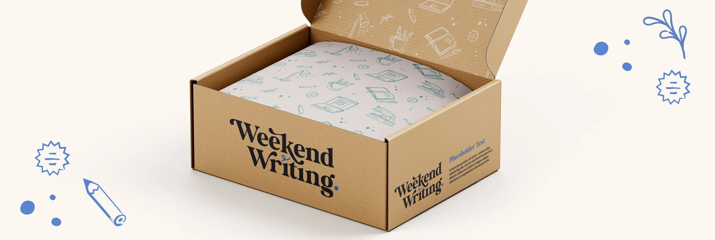
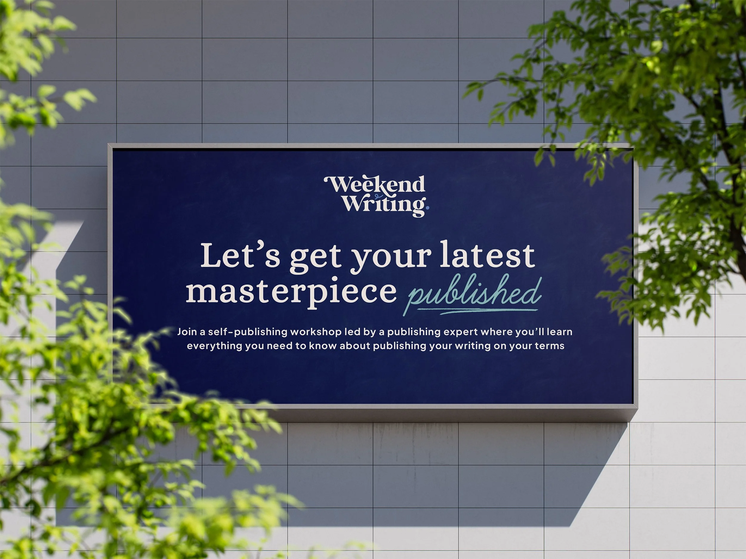
Branding.
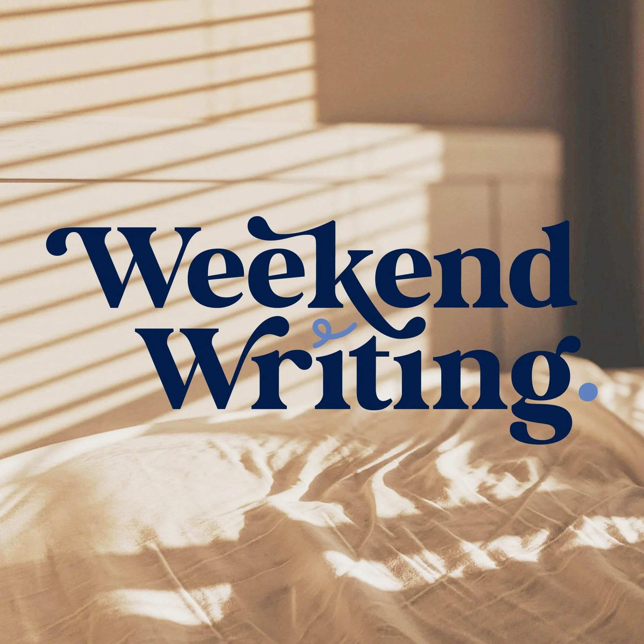
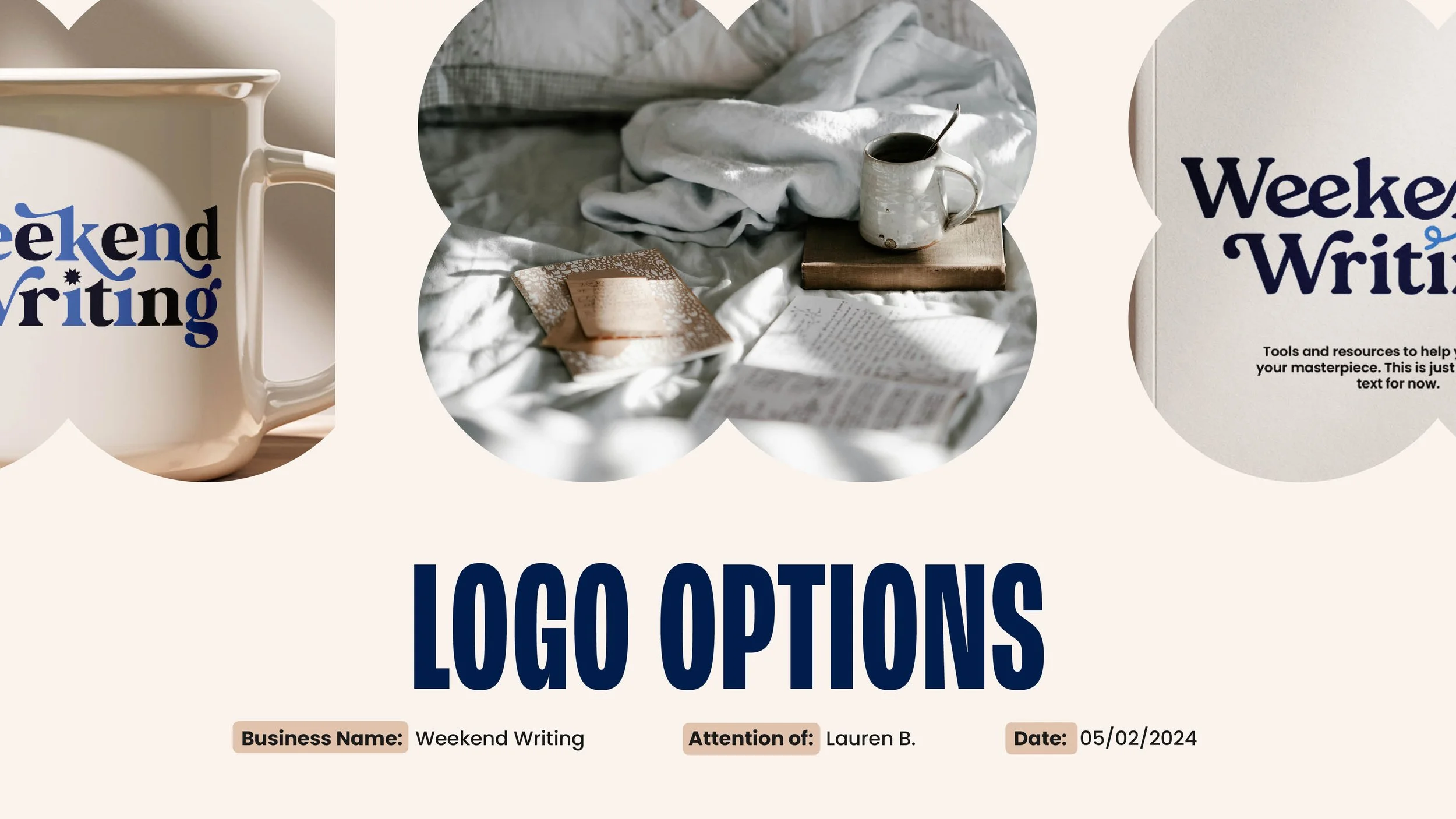
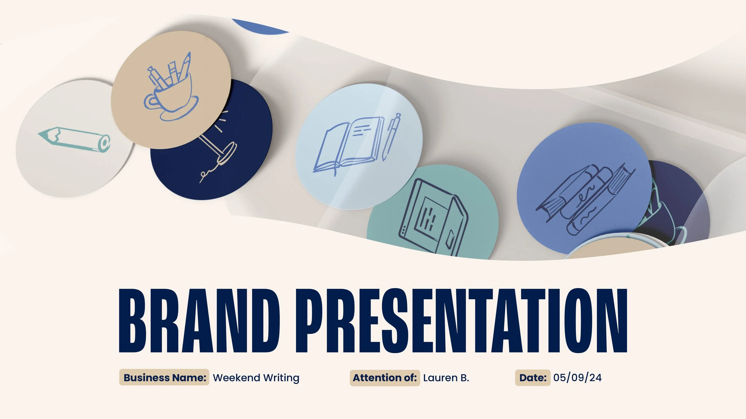
Weekend Writing
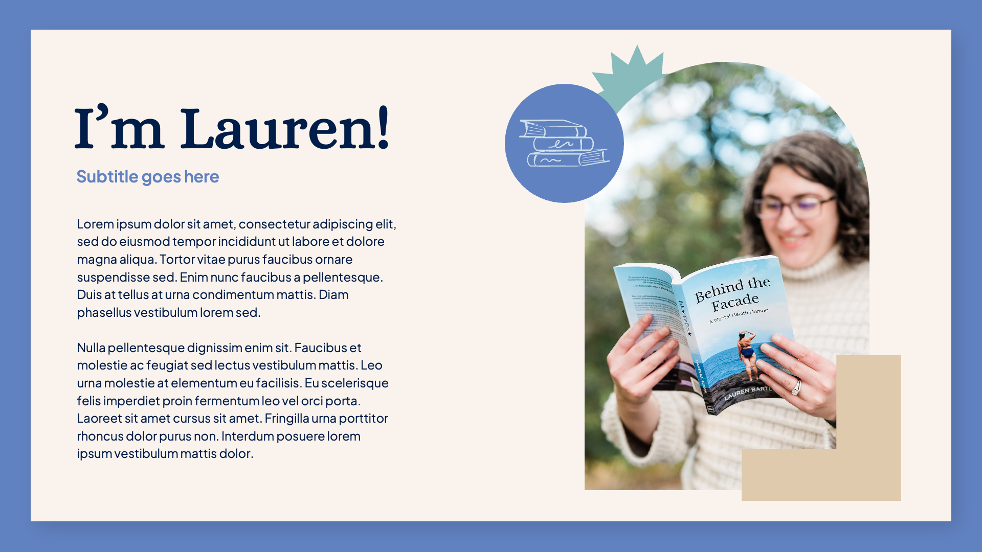
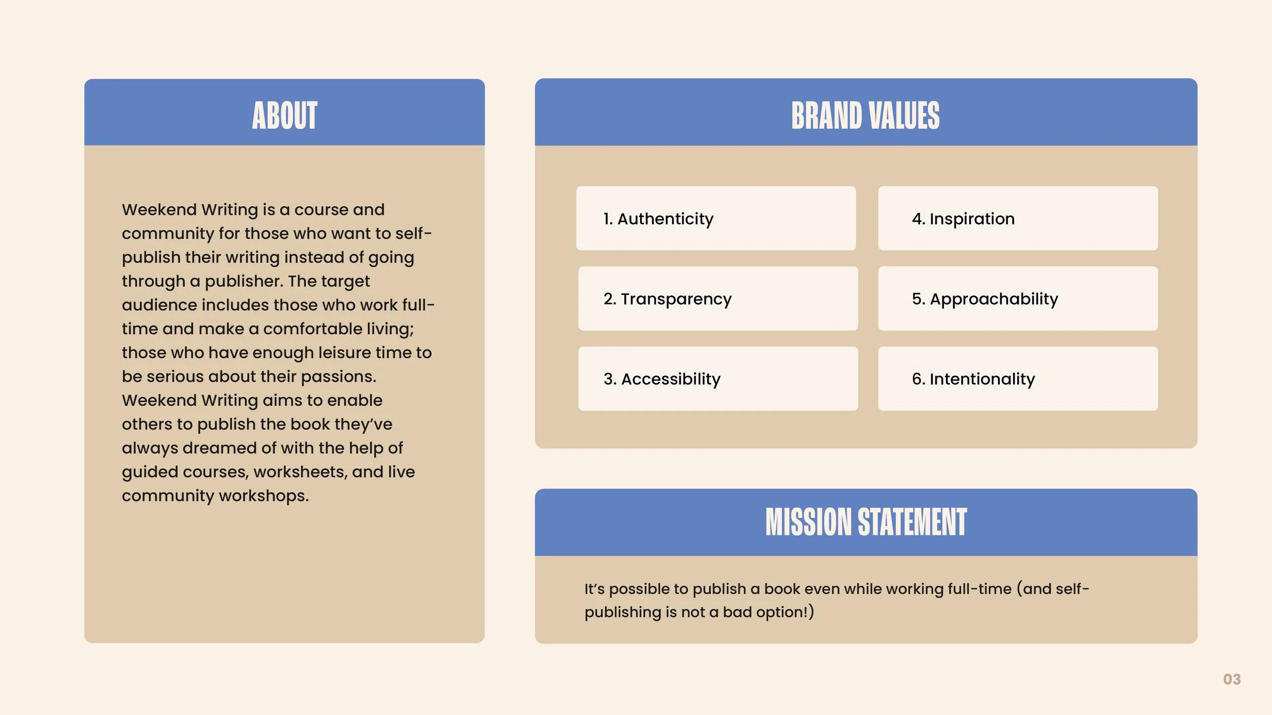
Lauren Bartleson is an accomplished indie writer having self-published multiple books. However, self-publishing isn’t always an easy or straightforward process and there aren’t many resources available to indie authors seeking to go it alone. Recognizing this need, Lauren started Weekend Writing, a dedicated community and set of resources for indie authors looking to self-publish their work. Her mission is to help ease the pain of self-publishing so that hobbyist writers (especially those with full-time jobs) can focus on the fun part: being creative.
Project Goal: Create a unique brand identity that projects an easygoing “creative living” aesthetic that appeals to indie/hobbyist writers. Attract and retain a community of writers and set the foundation for a business that is scalable over time.
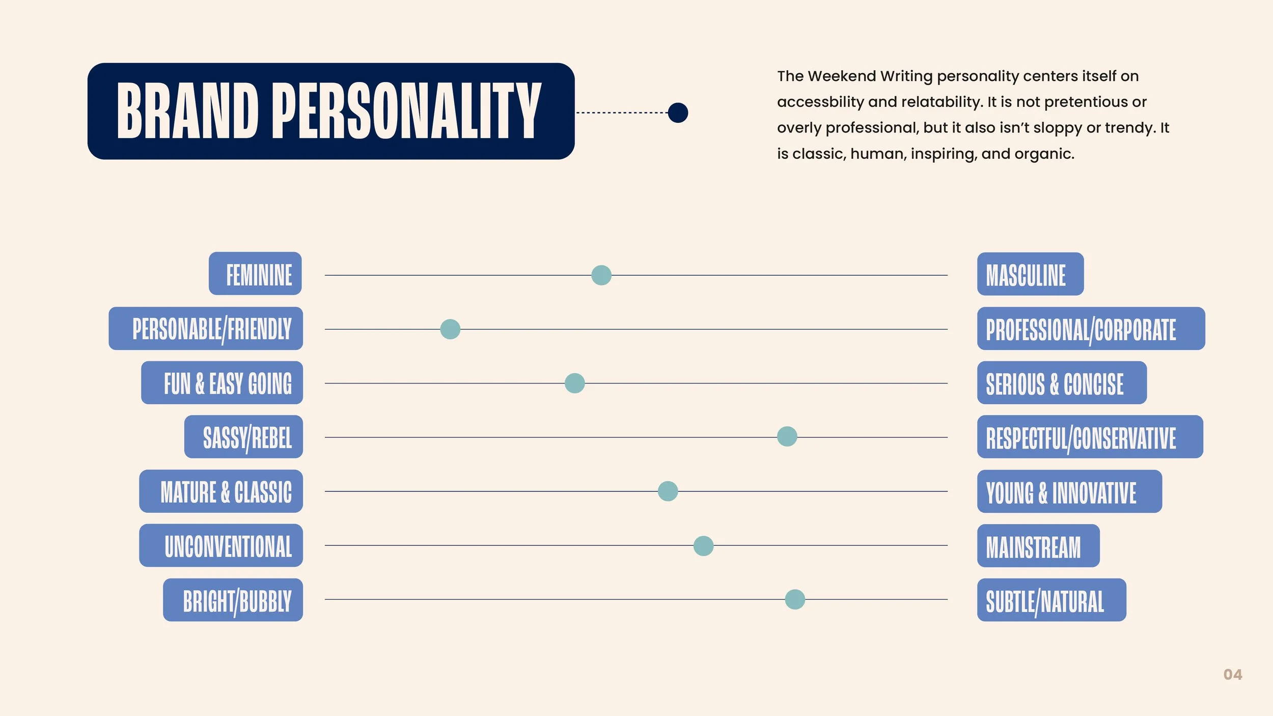
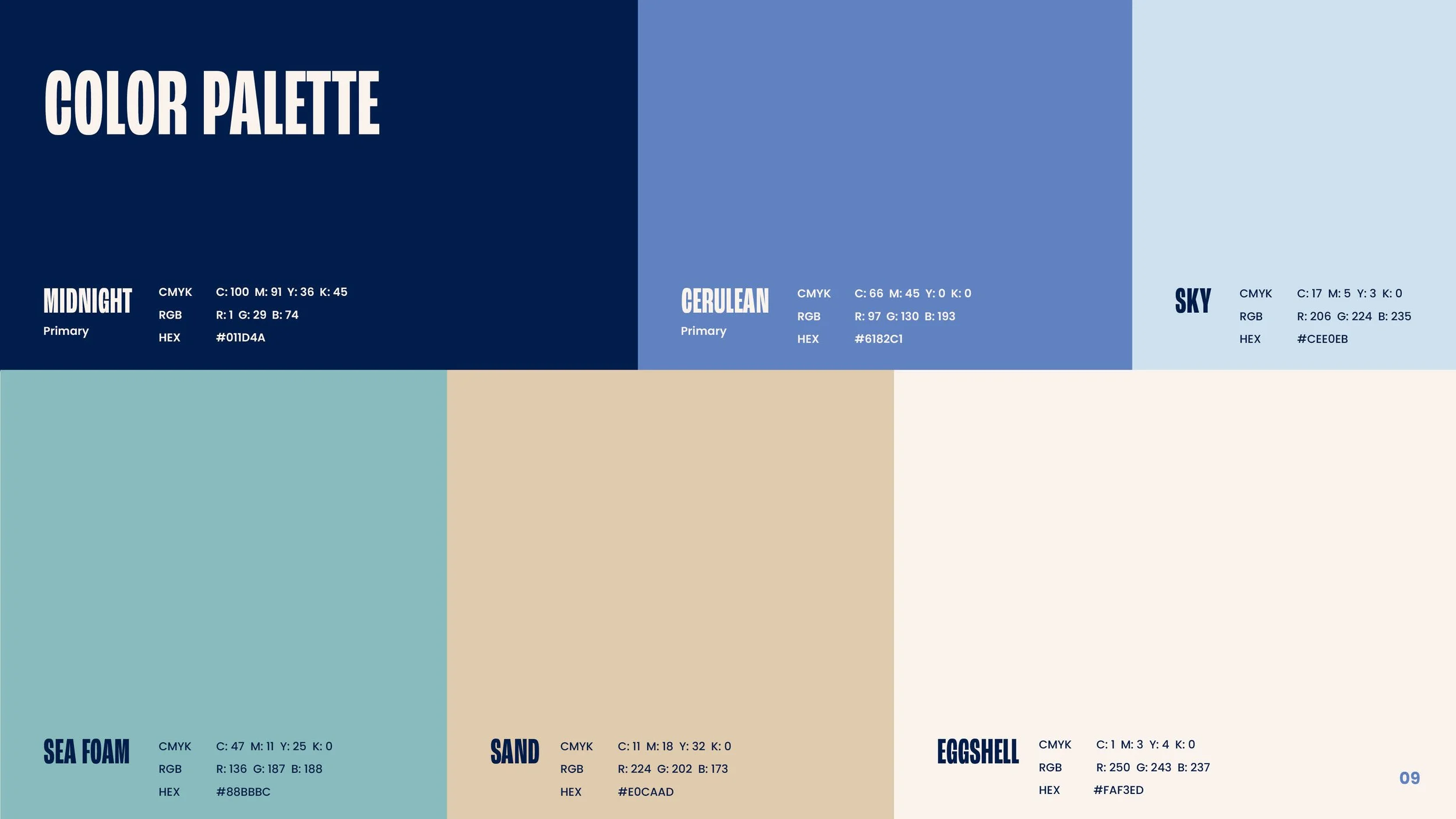
Creative Strategy: Build a visual system that incorporates hand-drawn elements and a soothing color palette that calls to mind slow, sleepy weekend mornings writing. Balance the organic components with more classic elements that allude to literary tradition.

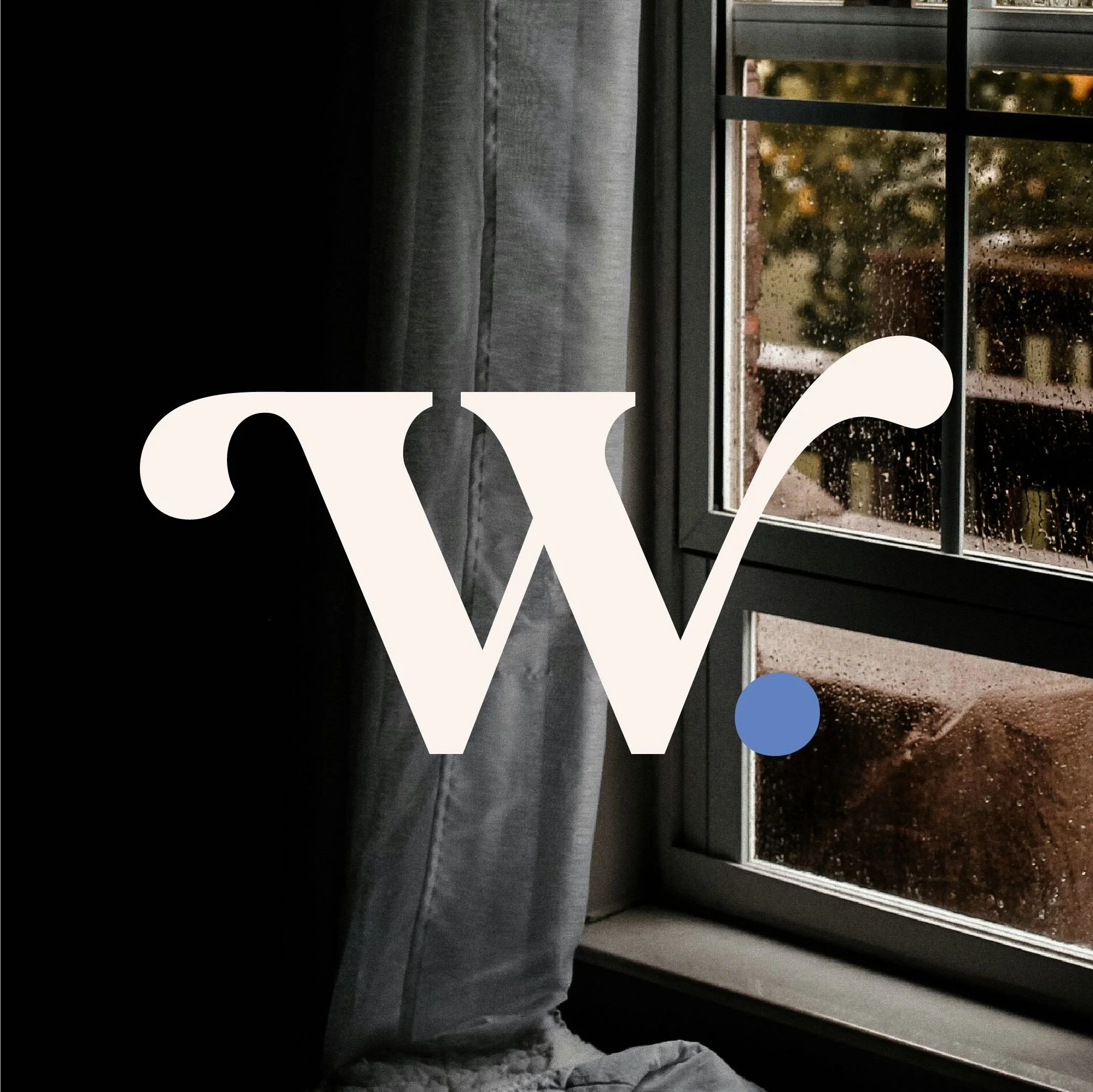
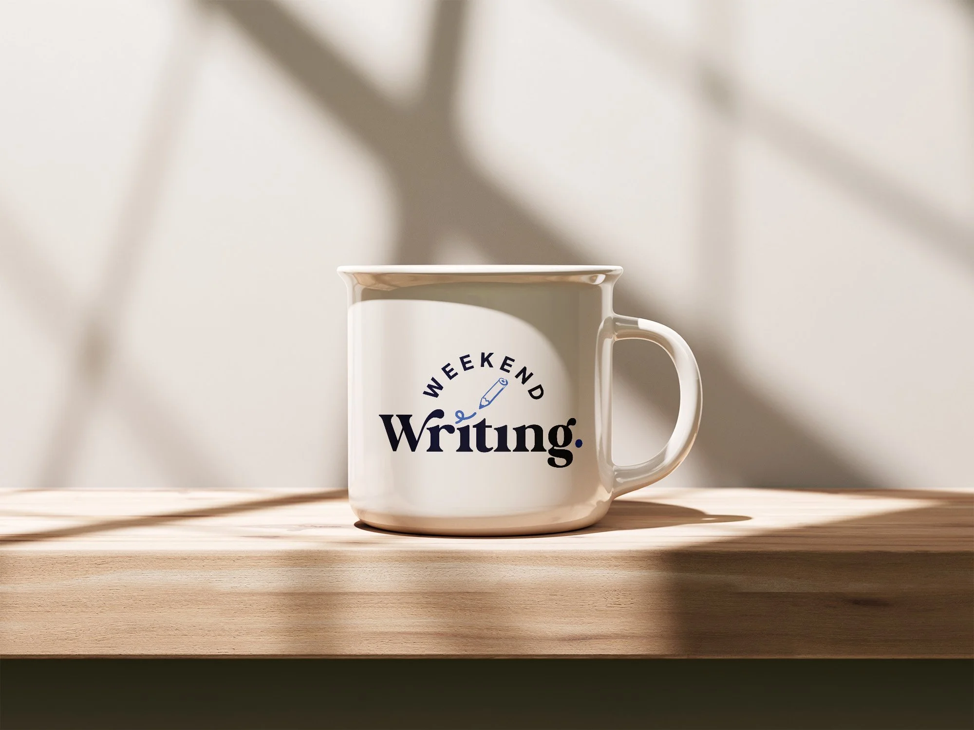
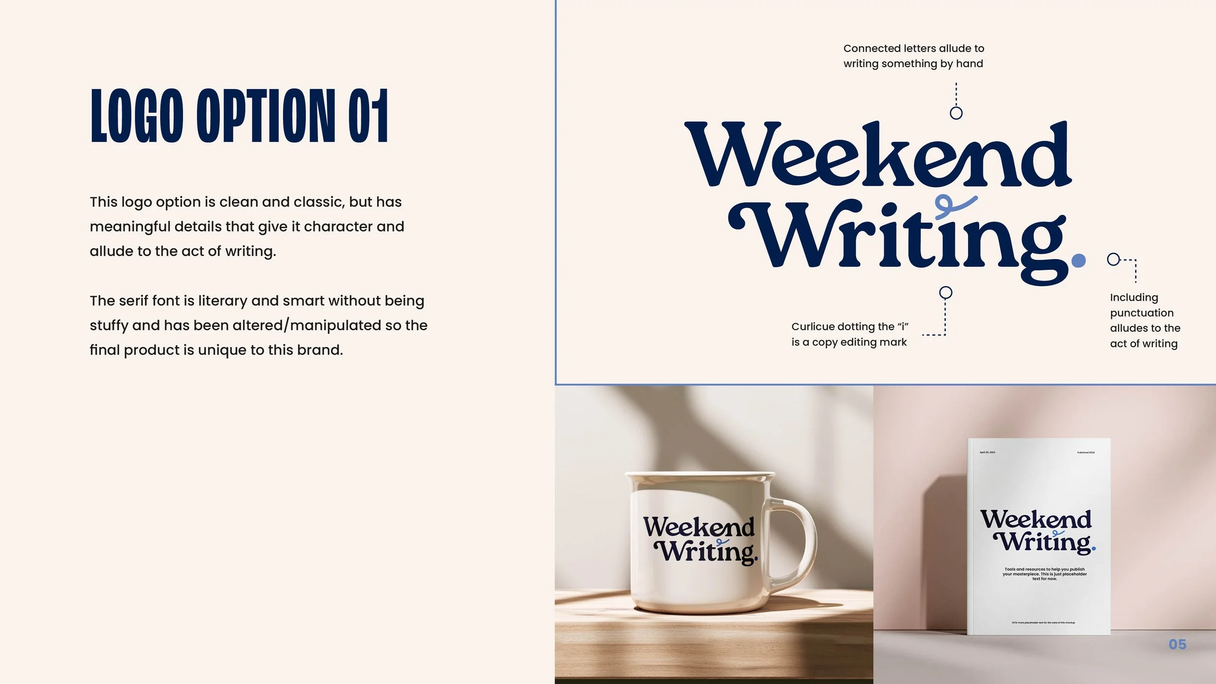
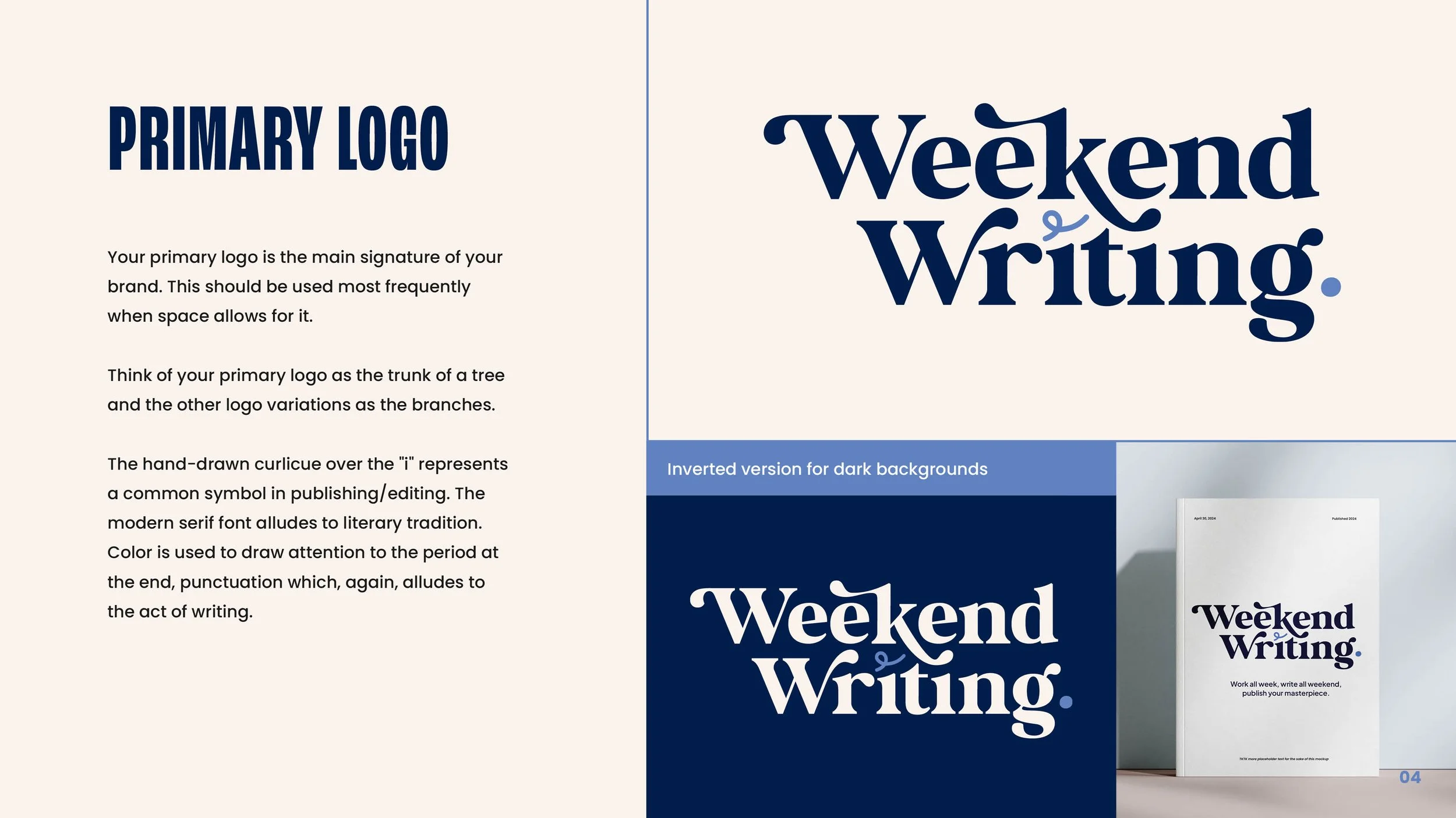
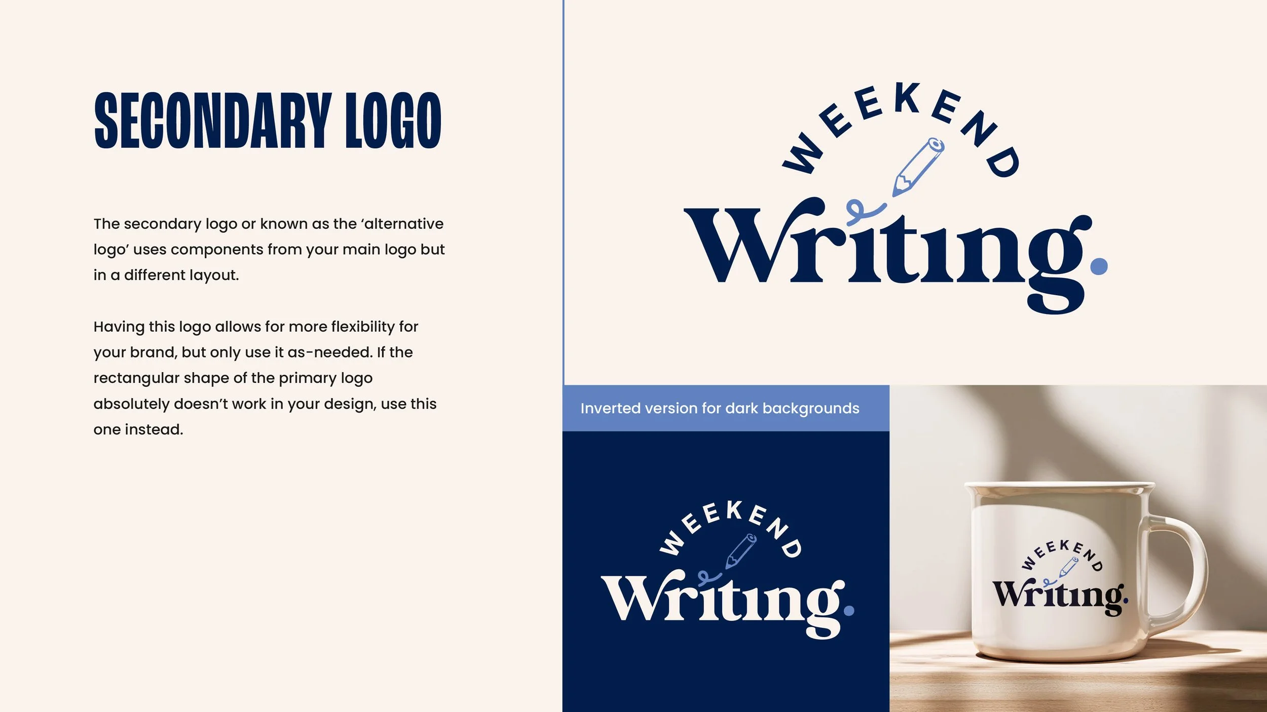
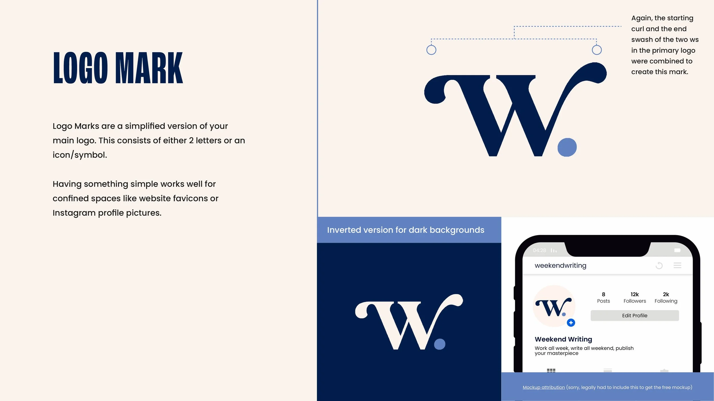
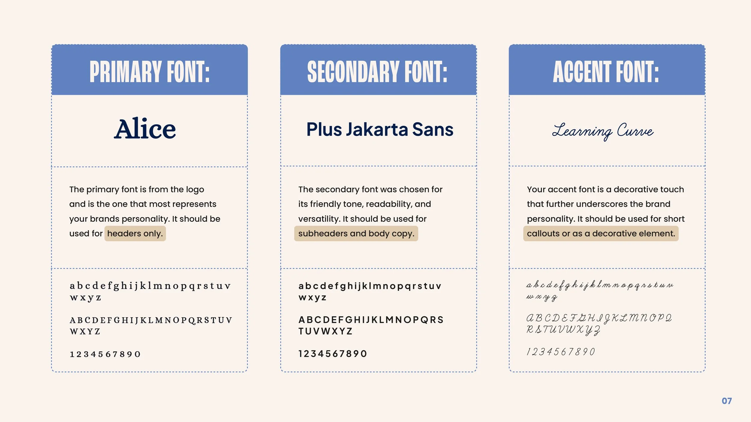
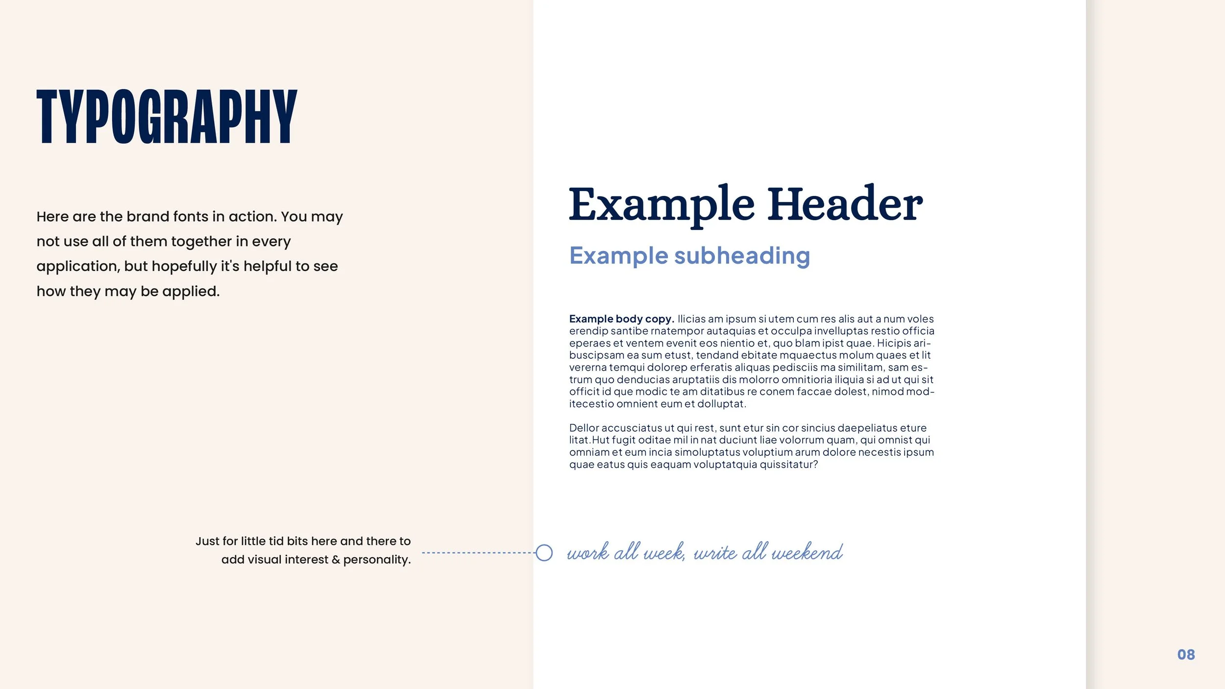
We landed on an elegant wordmark logo with meaningful details that allude to the act of writing–punctuation and a copy-editing mark above the i. The classic serif typeface speaks to literary tradition, but was customized for visual interest and a sense of creativity and whimsy.


Presentation Template
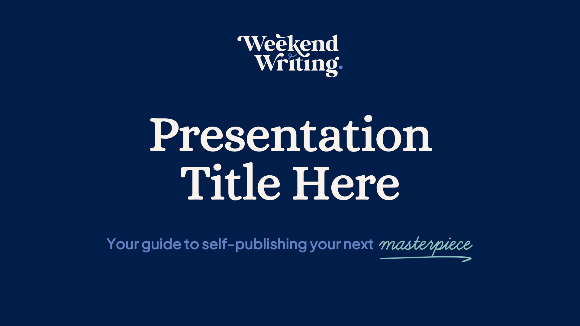
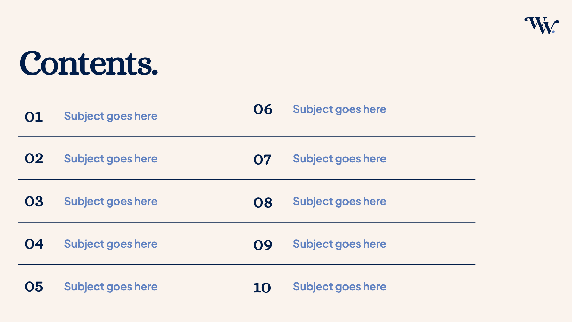
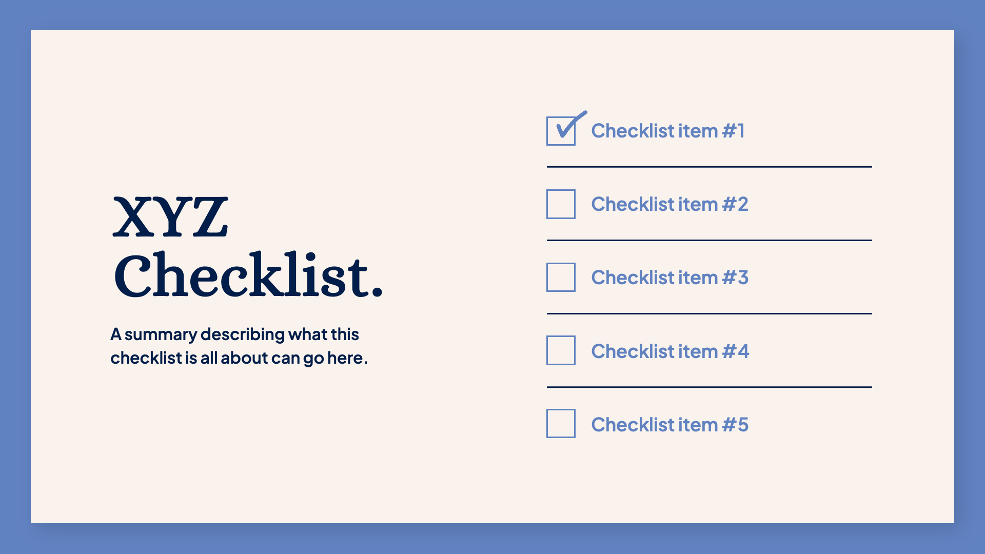
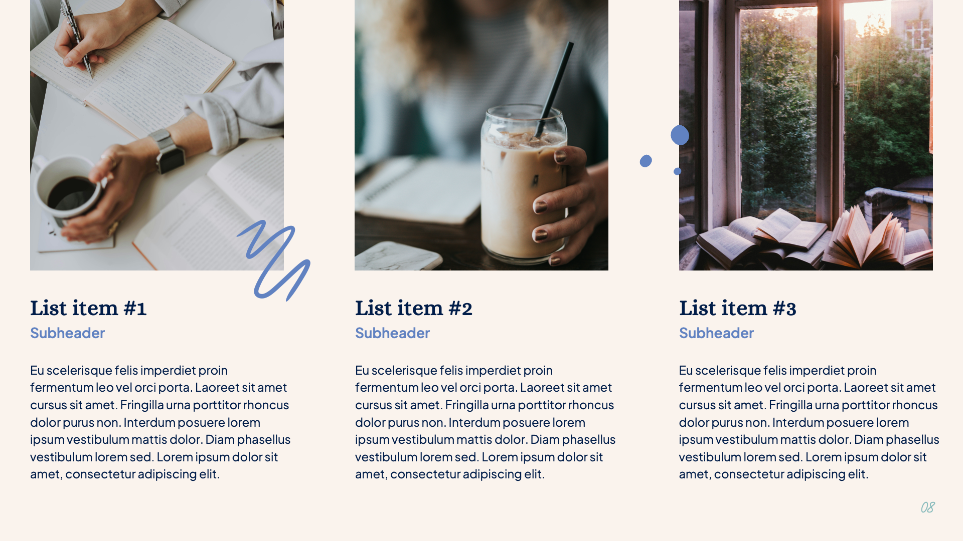
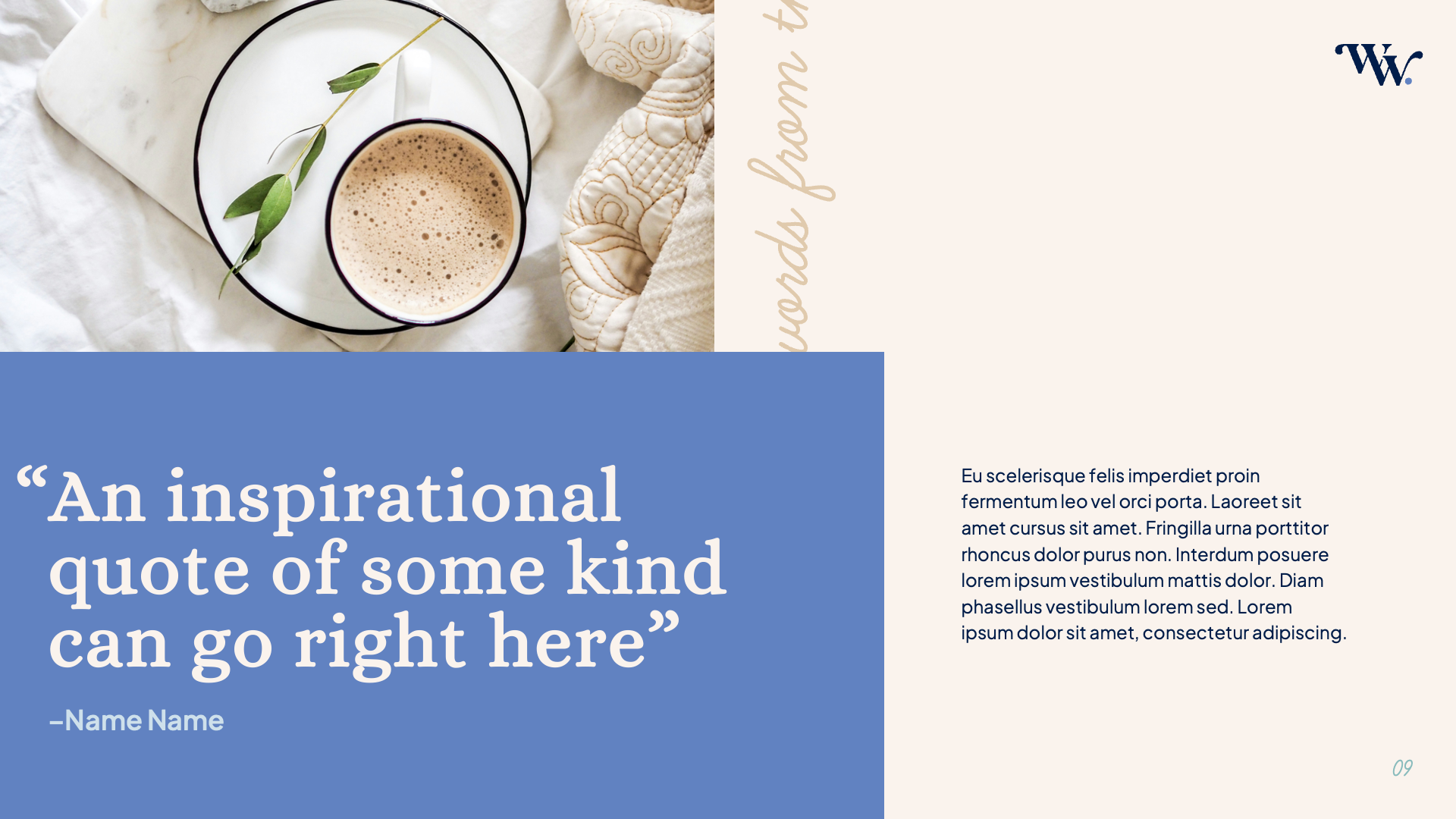
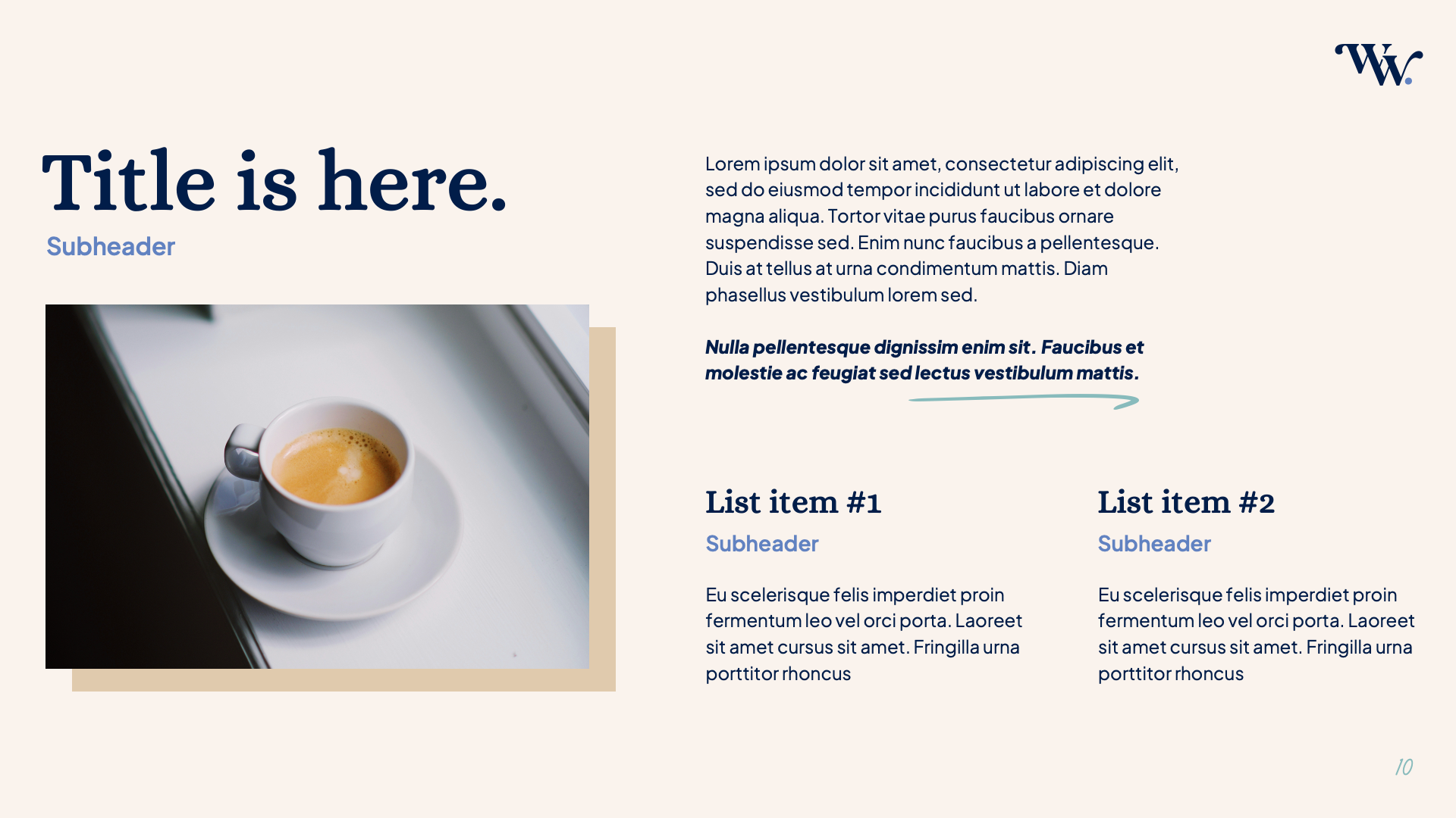
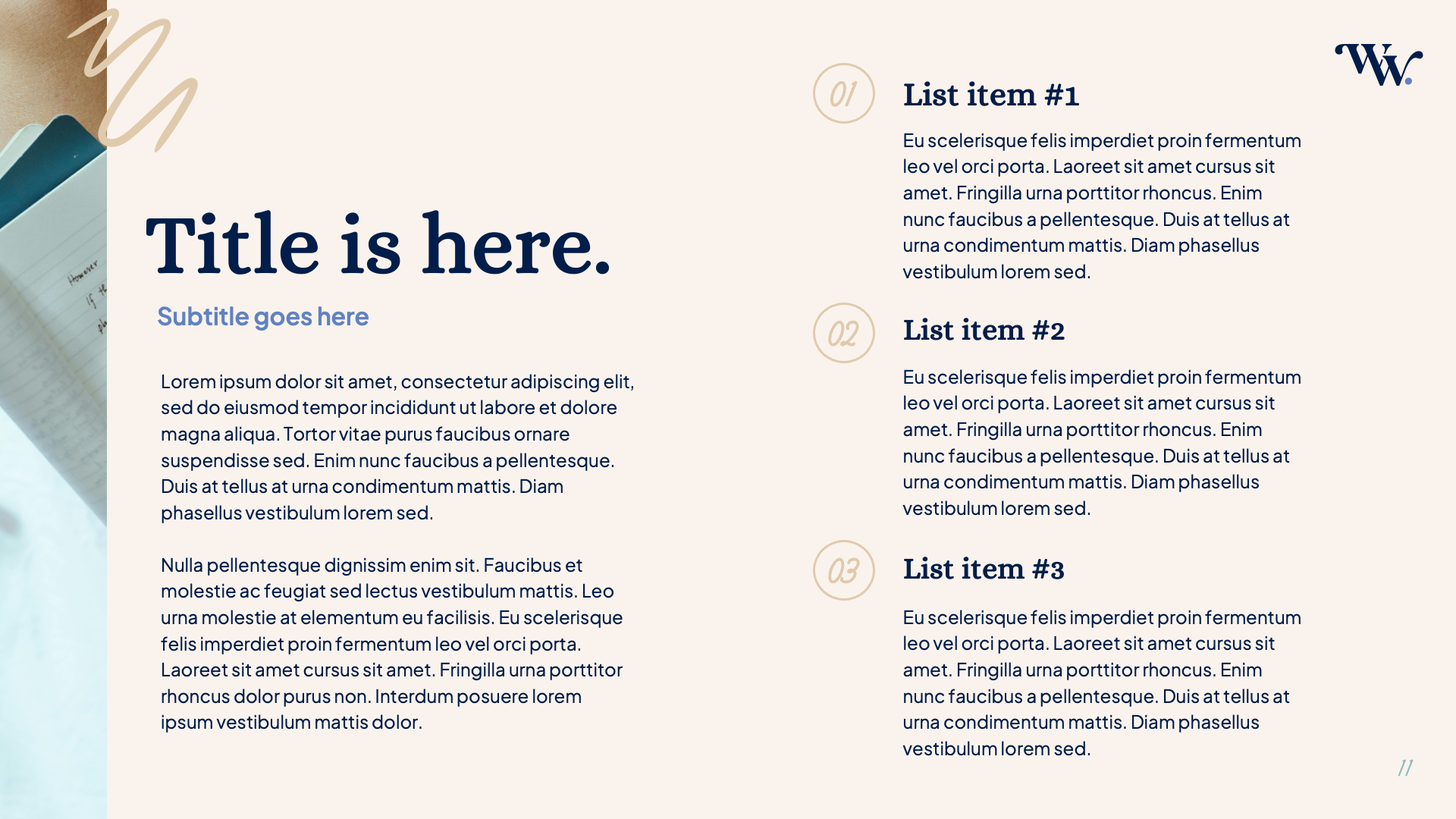
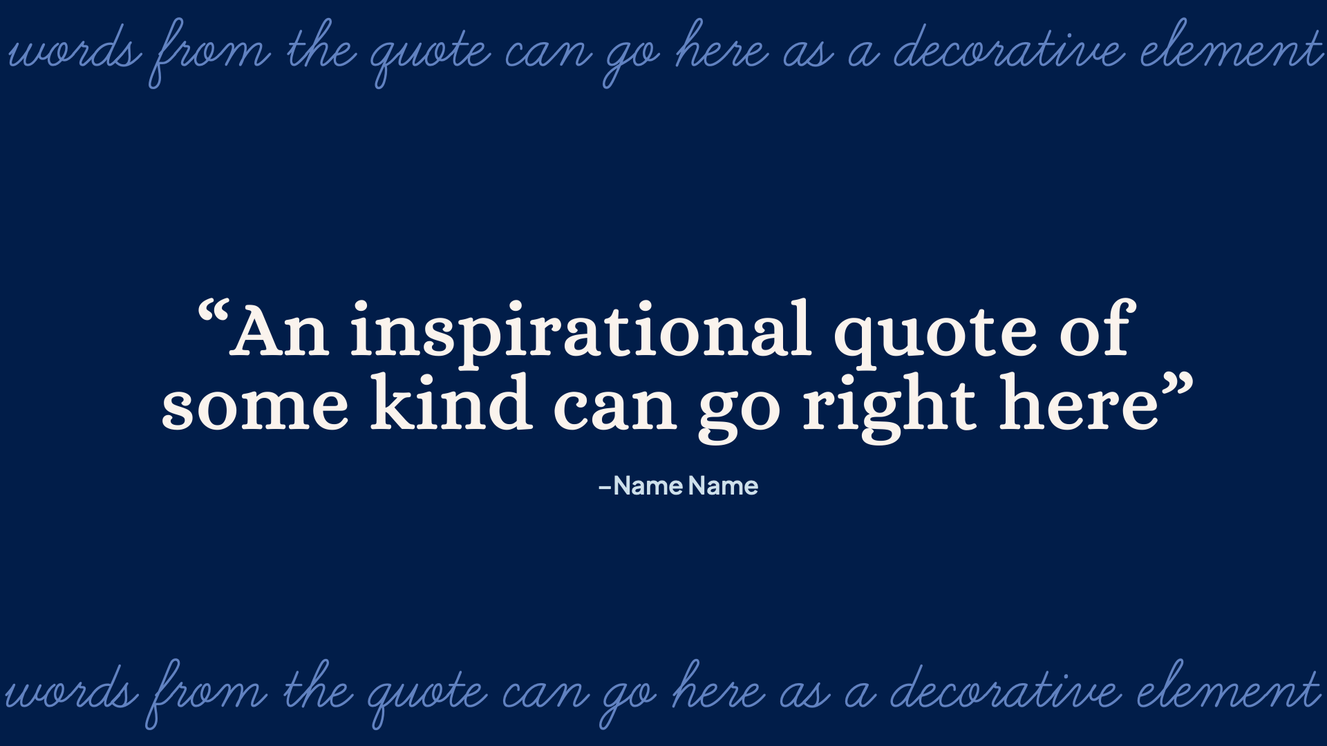
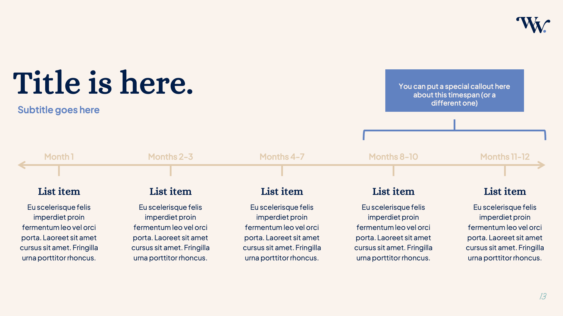
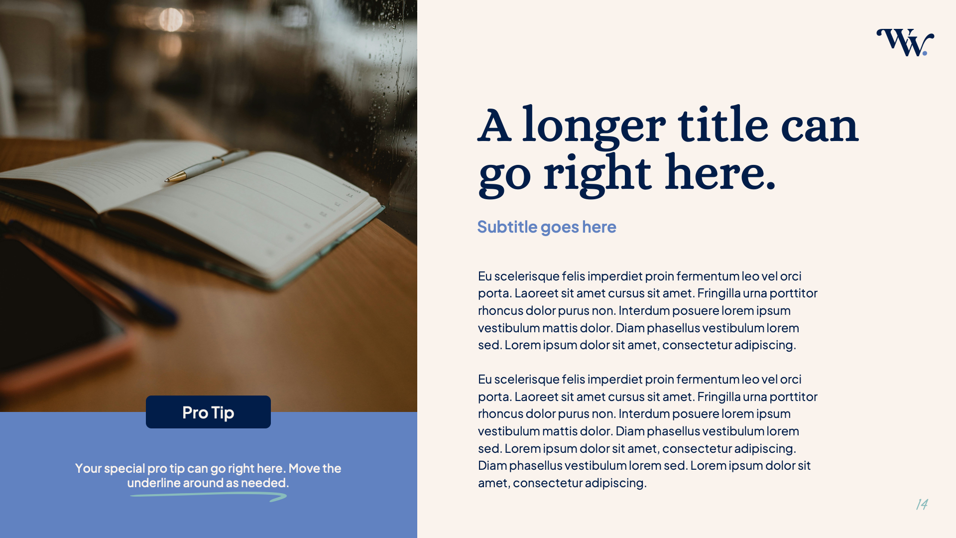
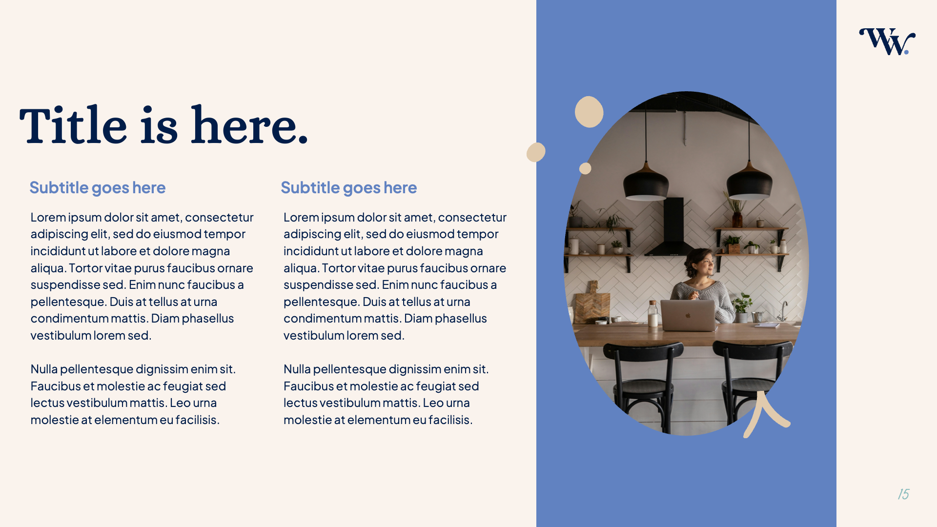
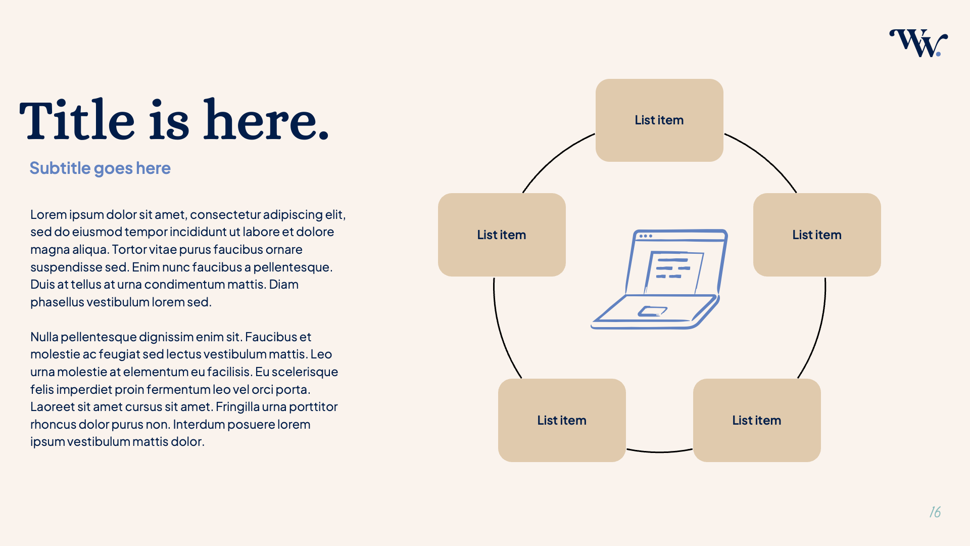
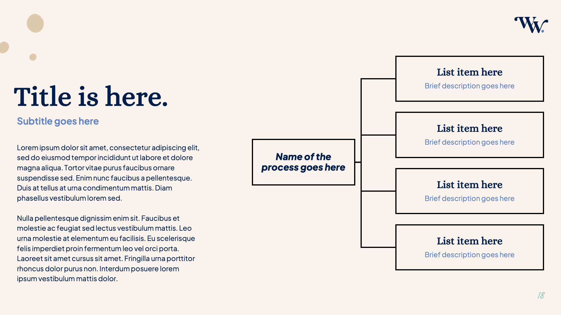
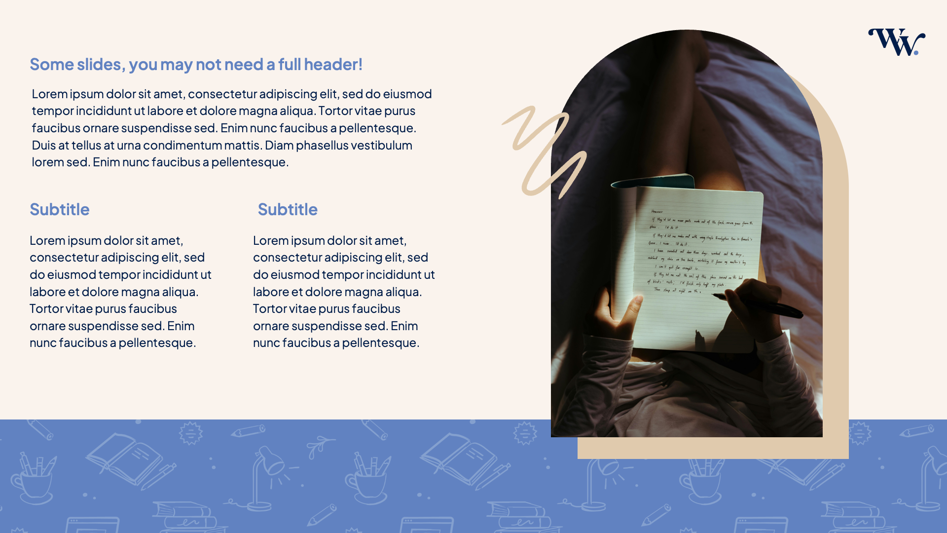
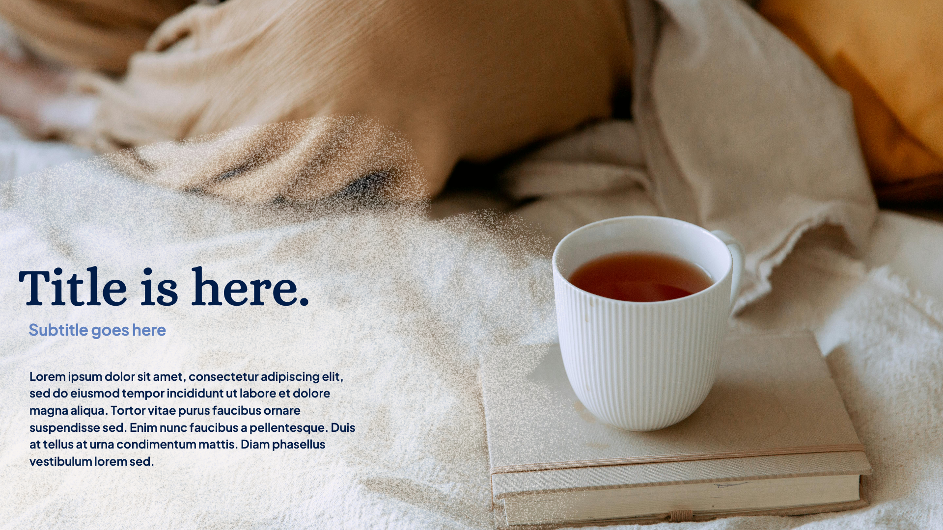
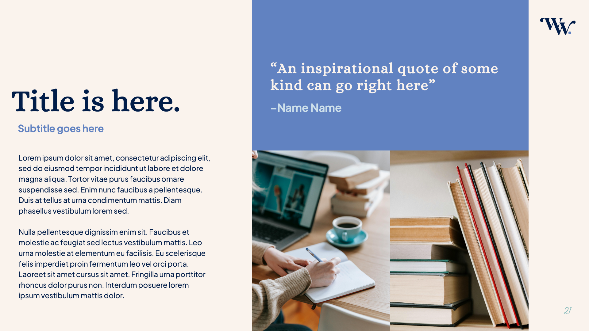
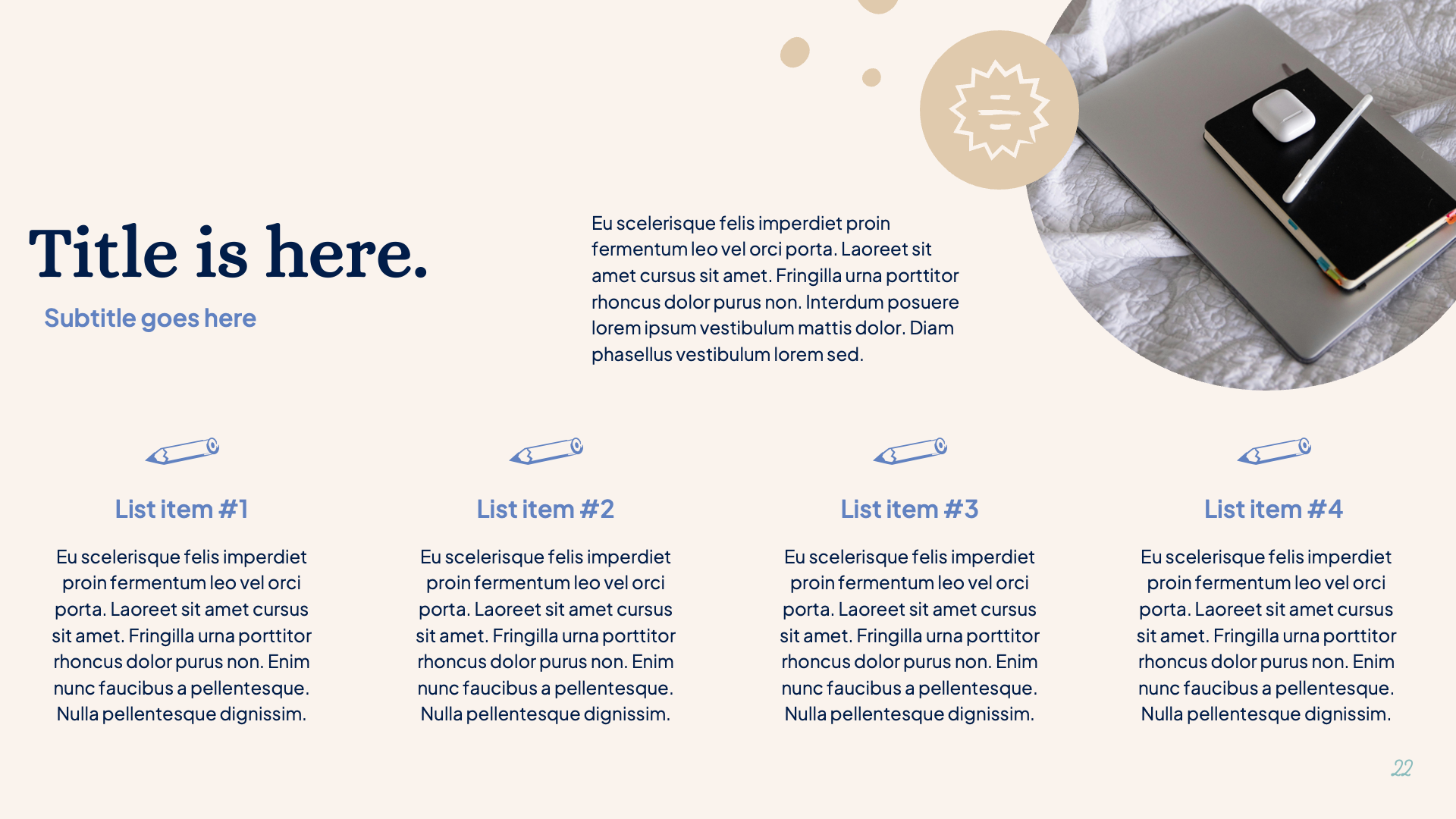
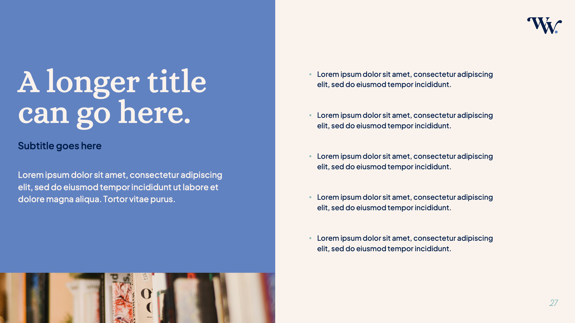
To support her expanding workshop series, Lauren needed a clear, flexible presentation deck that felt both polished and distinctly Weekend Writing. I created a customizable template system that brings consistency, clarity, and brand personality to every session she leads.
The Process
Establishing Creative Direction
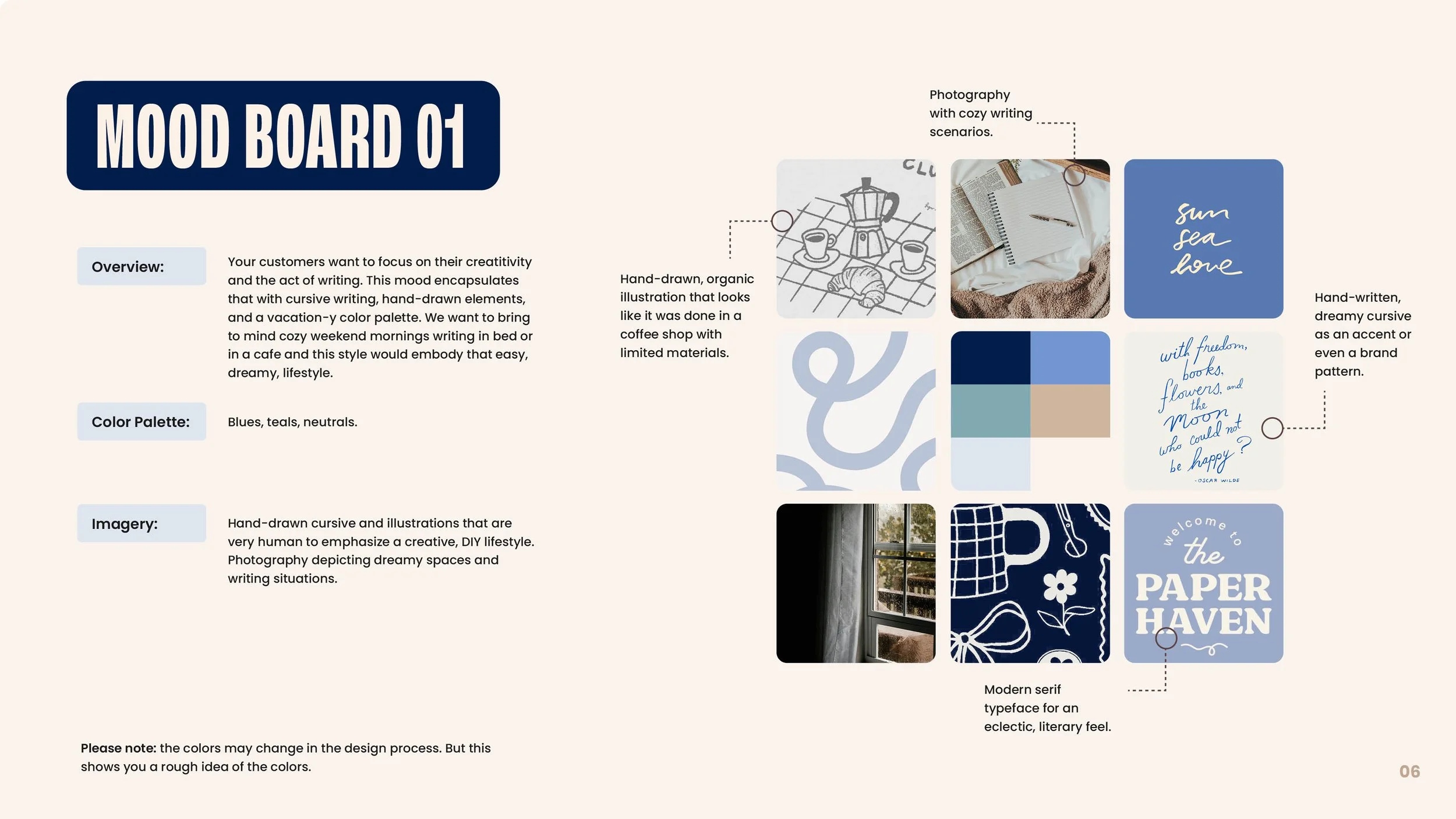
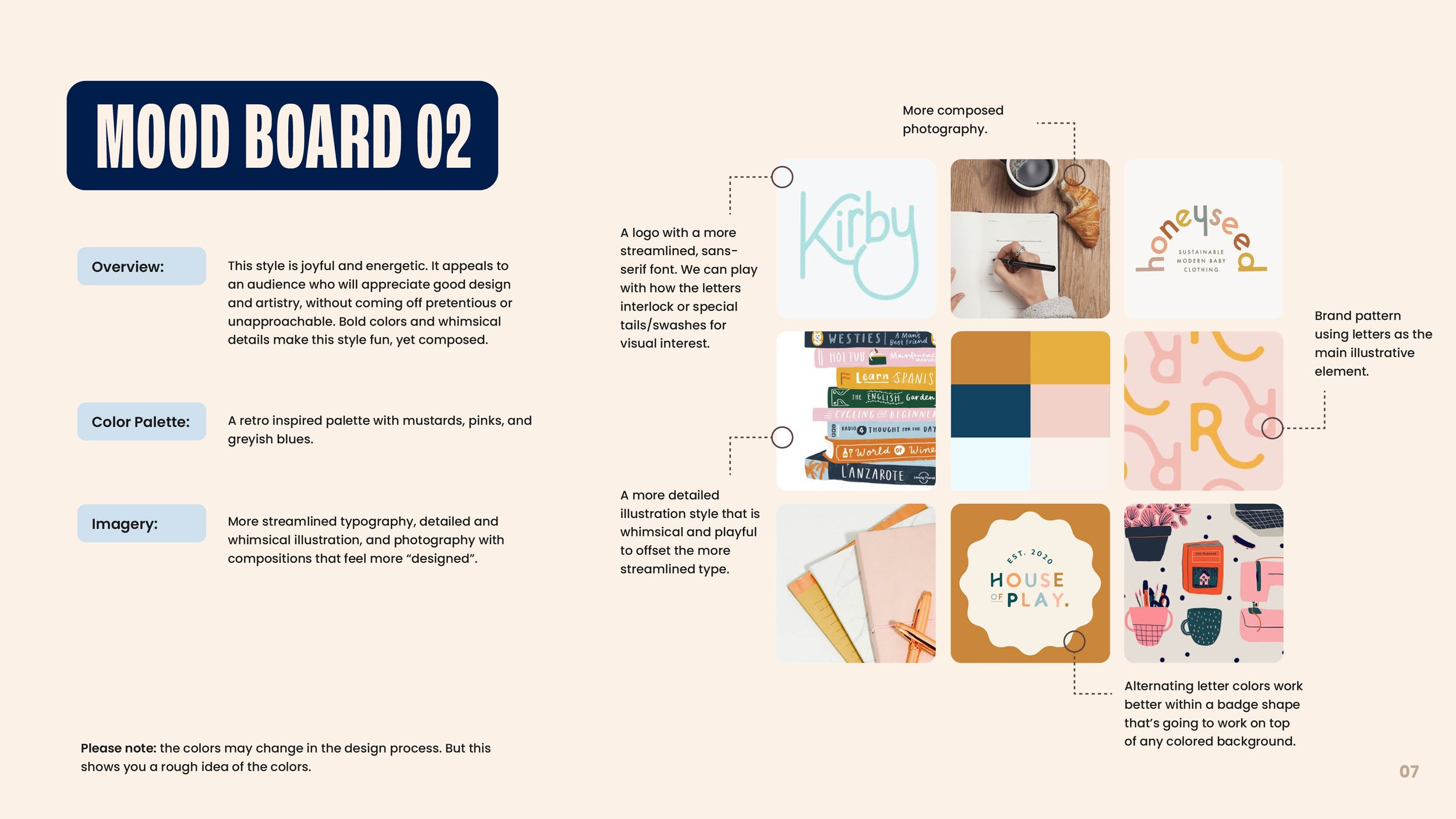
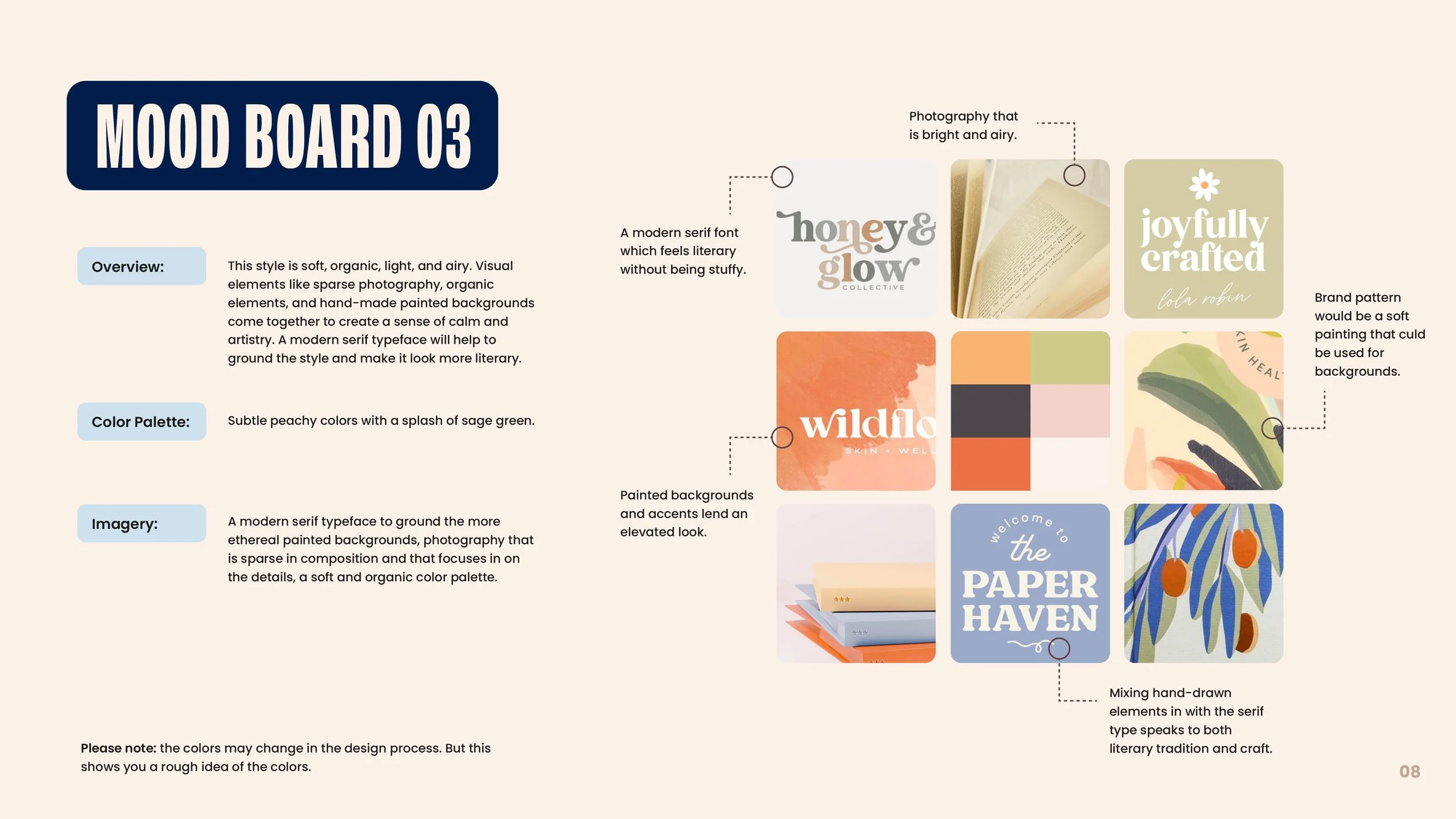
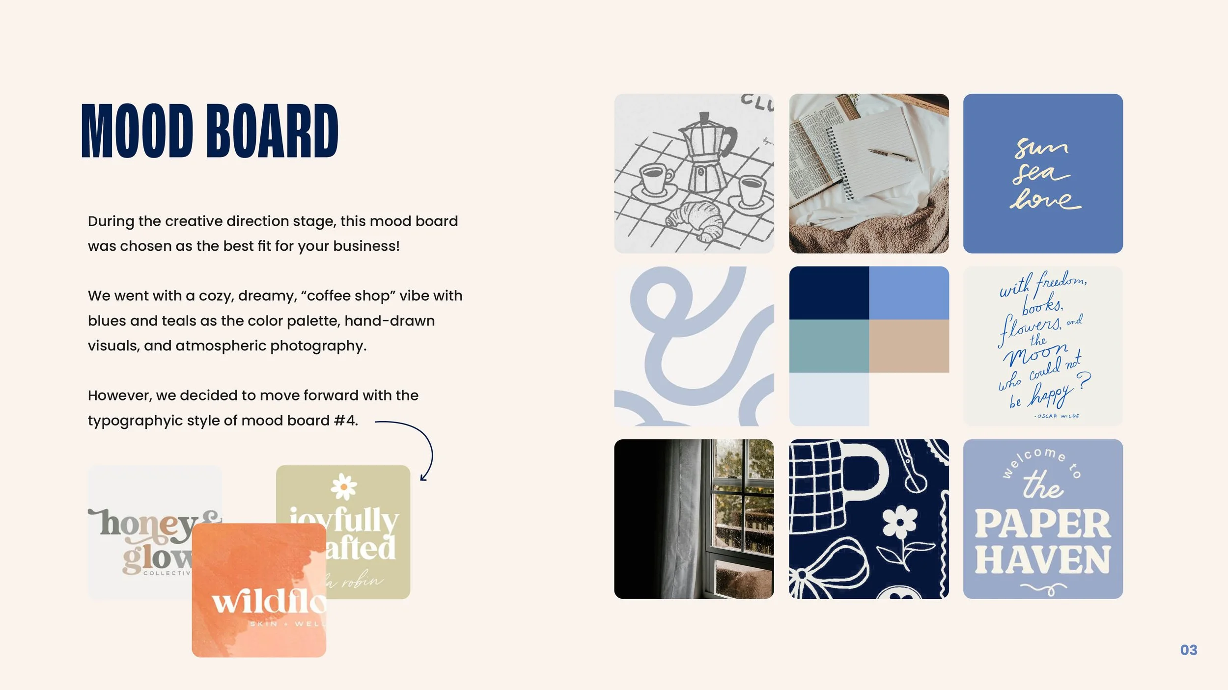
Before diving into design, it’s essential to define the core markers of a brand’s personality. I do this by outlining the brand’s values, mission, and overall tone. Once I have a clear understanding of what we want to communicate, I create three mood board options, each with notes explaining how the typography, color palette, and logo inspiration align with our creative strategy. Below is the mood board the client selected for the final branding (mood board #1) as well as a couple of creative directions we did not move forward with.
The Logo Presentation / Some Reject Logos
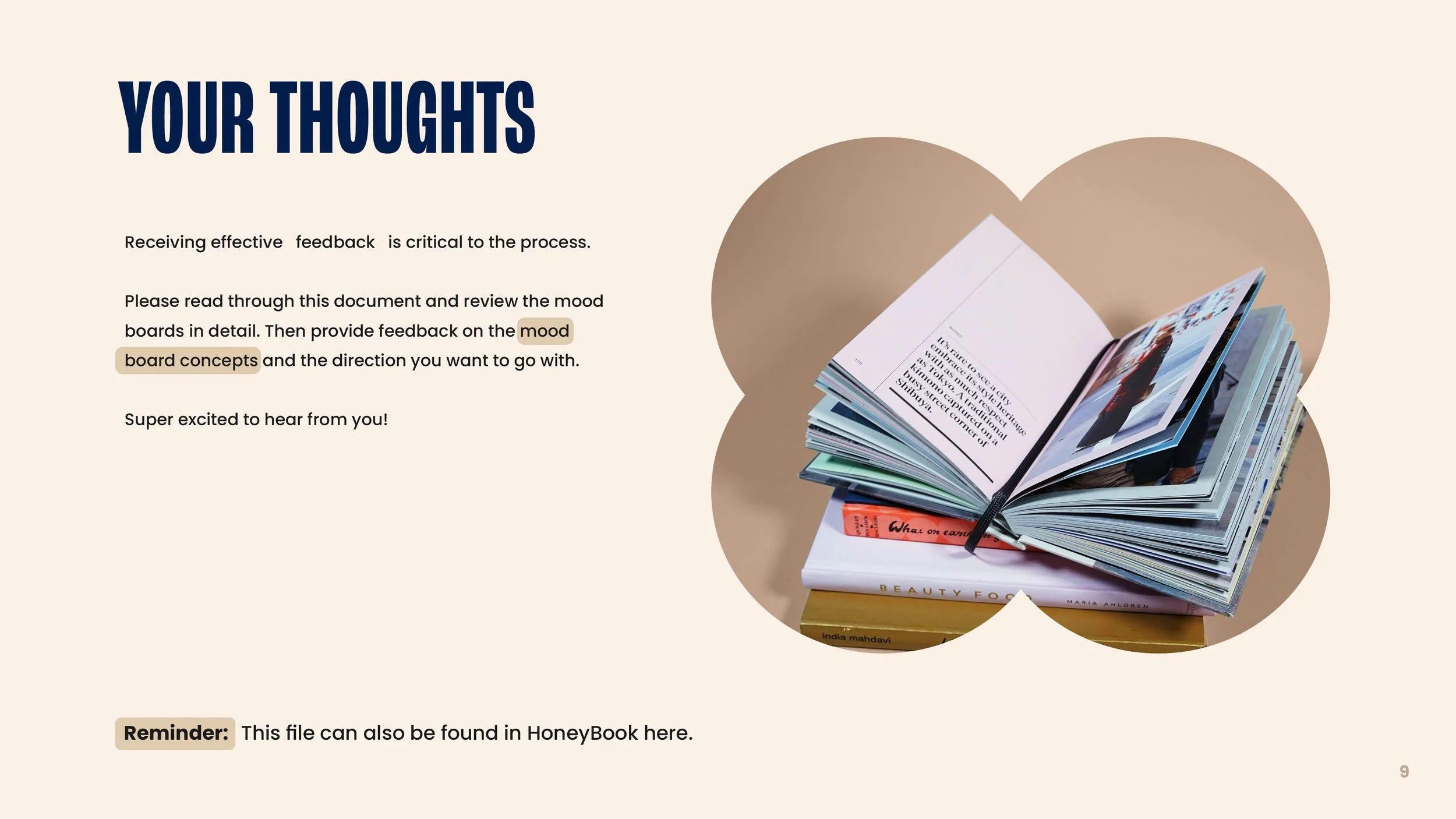
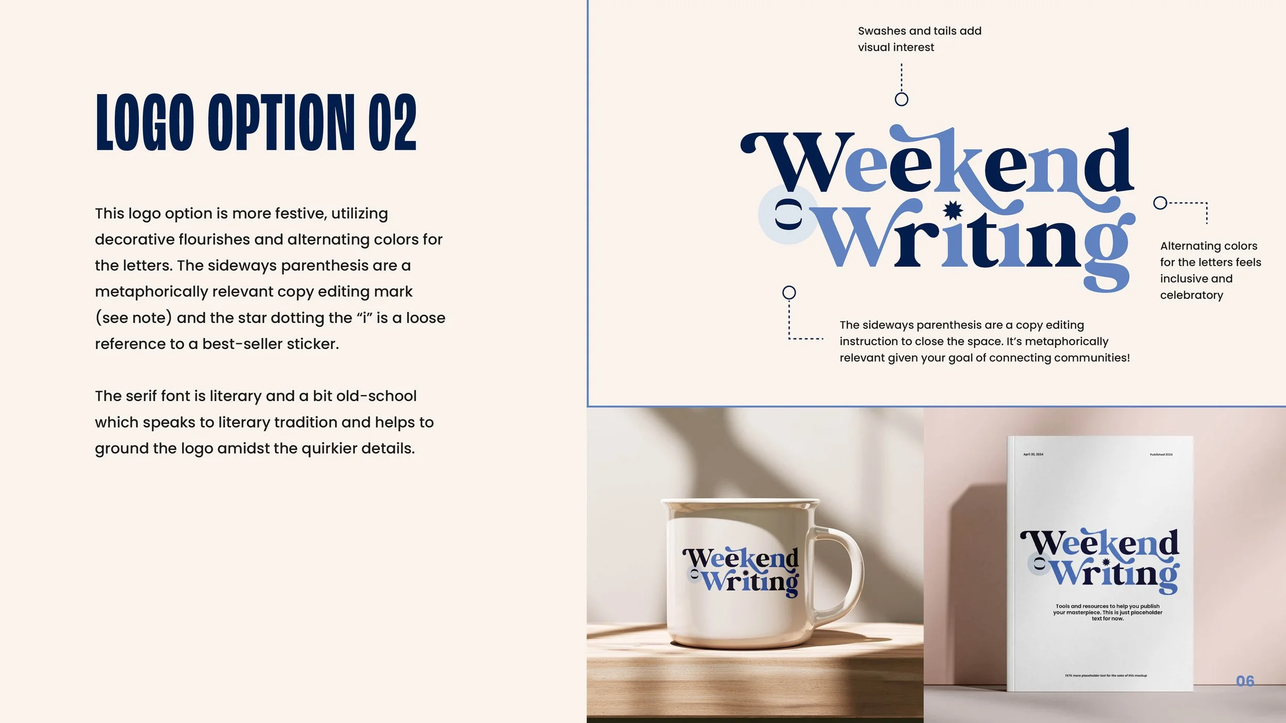
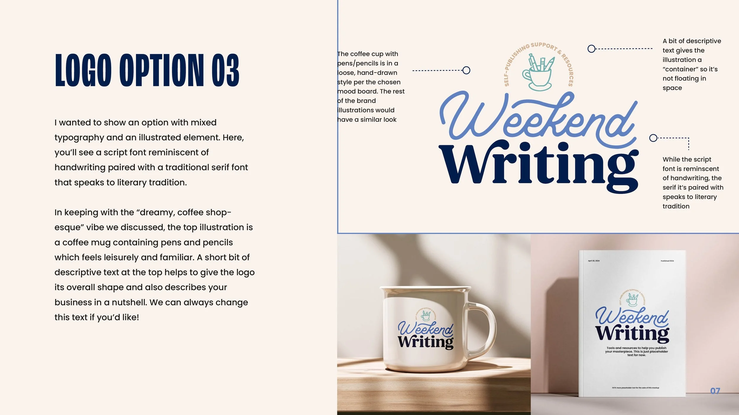
Presenting logo concepts within a clear, thoughtful presentation is essential because it helps clients understand the why behind the work—not just the visuals. A strong brand mark is rooted in strategy, meaning, and practical considerations, and walking through your decisions builds trust, reduces subjective feedback, and ensures stakeholders see how each choice supports their goals. Below, you’ll find snippets from my logo presentation, which includes a couple logos we did not move forward with. Ultimately, we went with Logo option #1 with some adjustments.
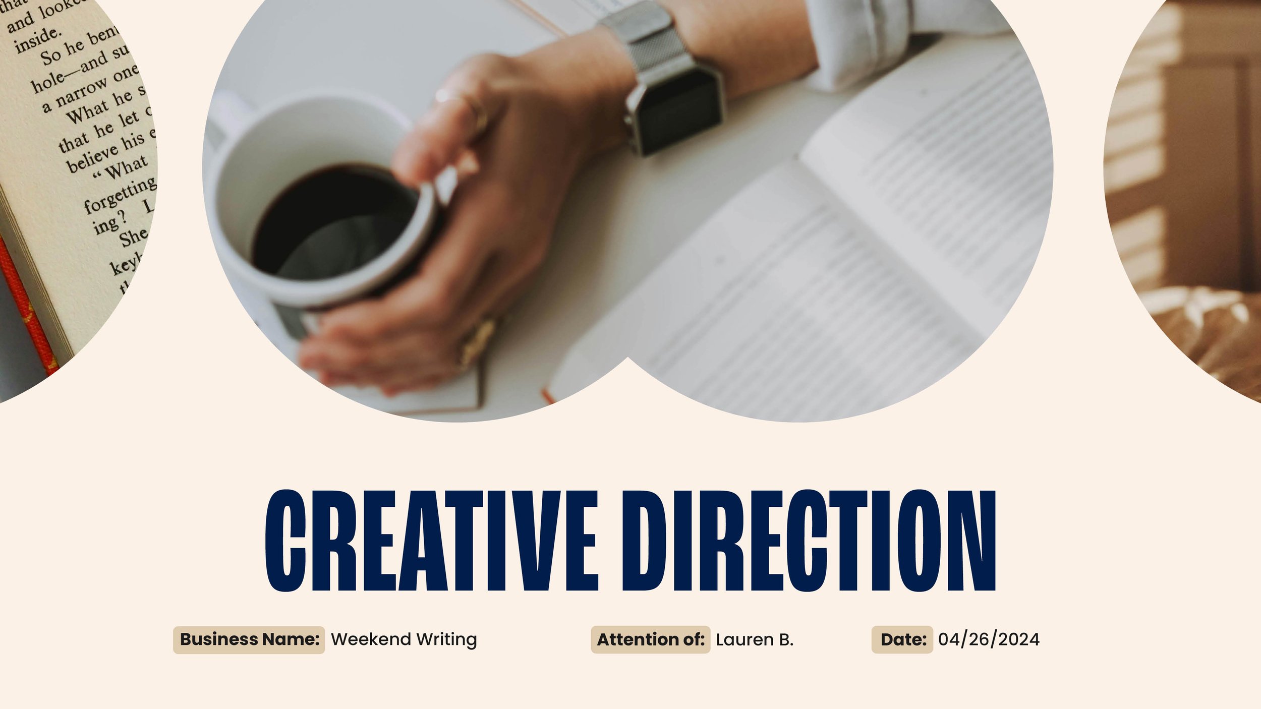
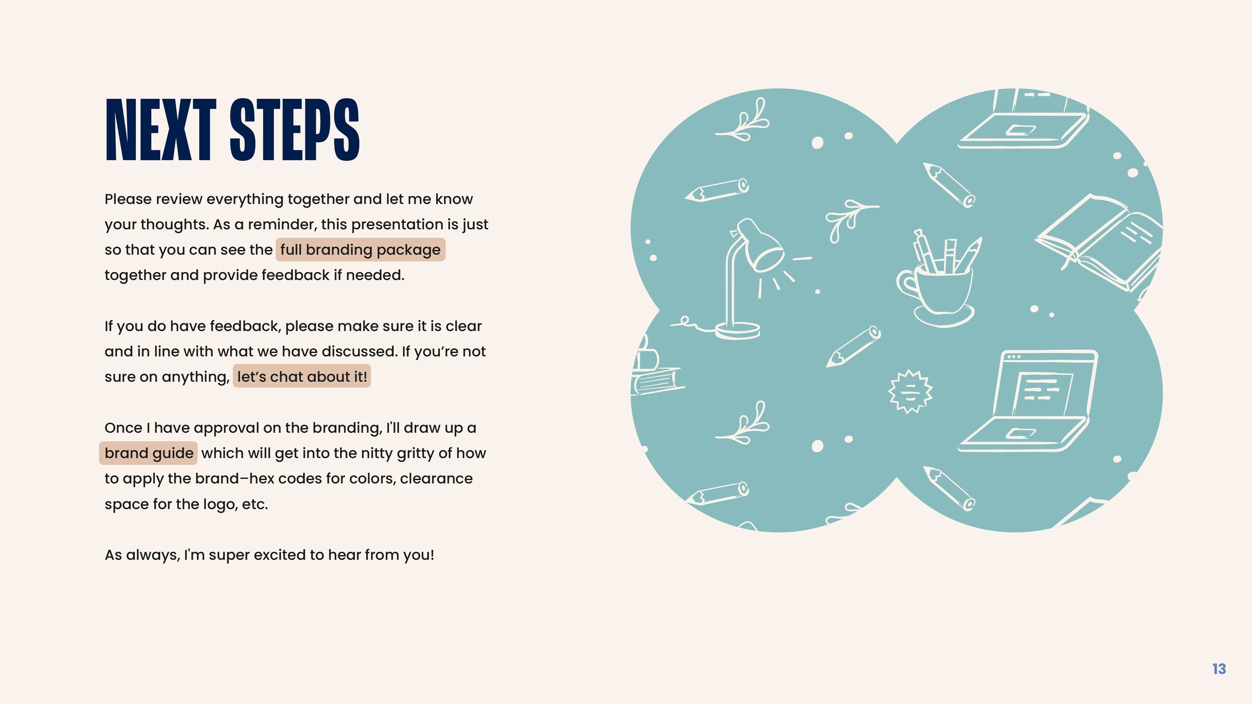
Brand Presentation & Guidelines
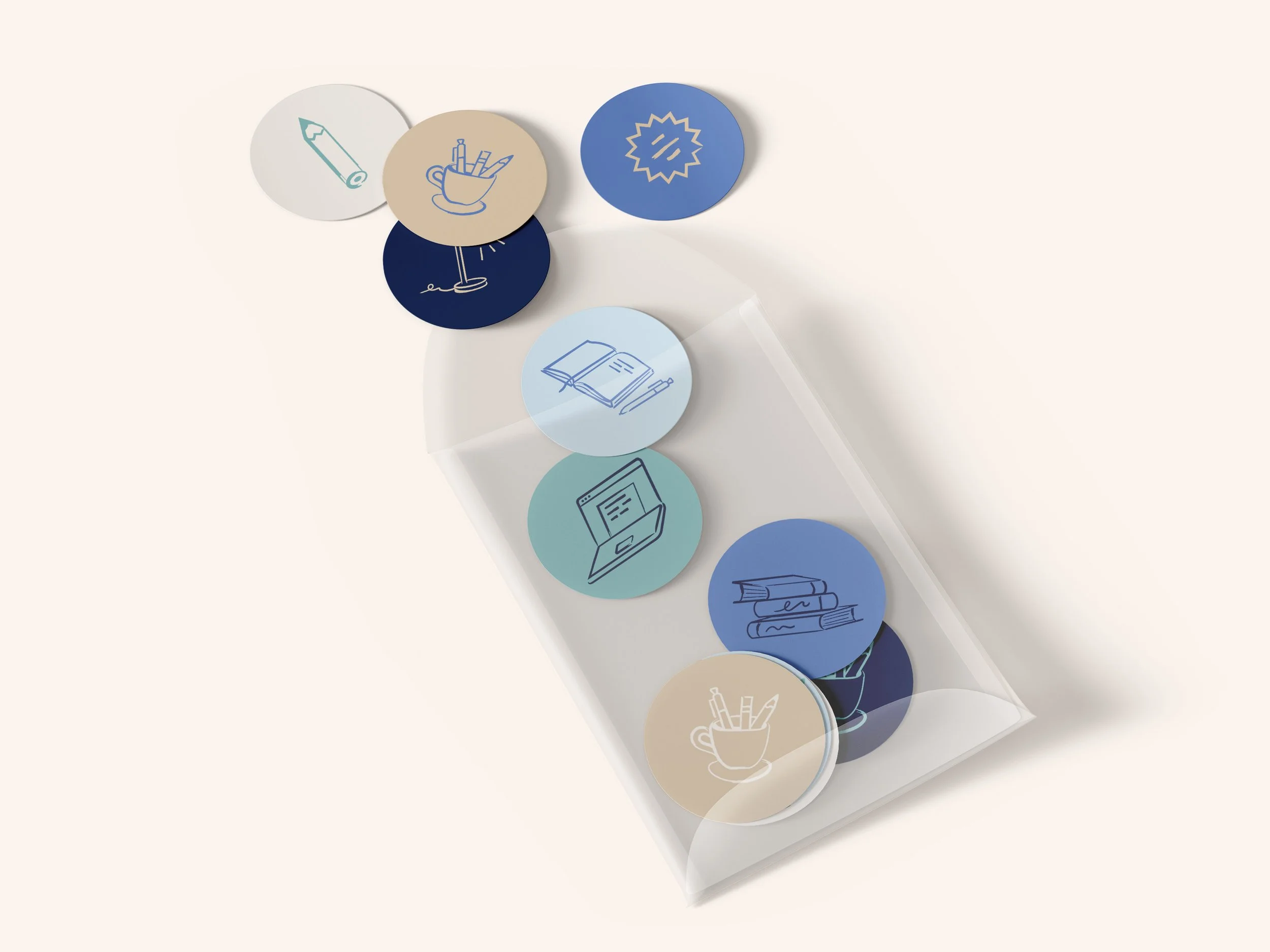
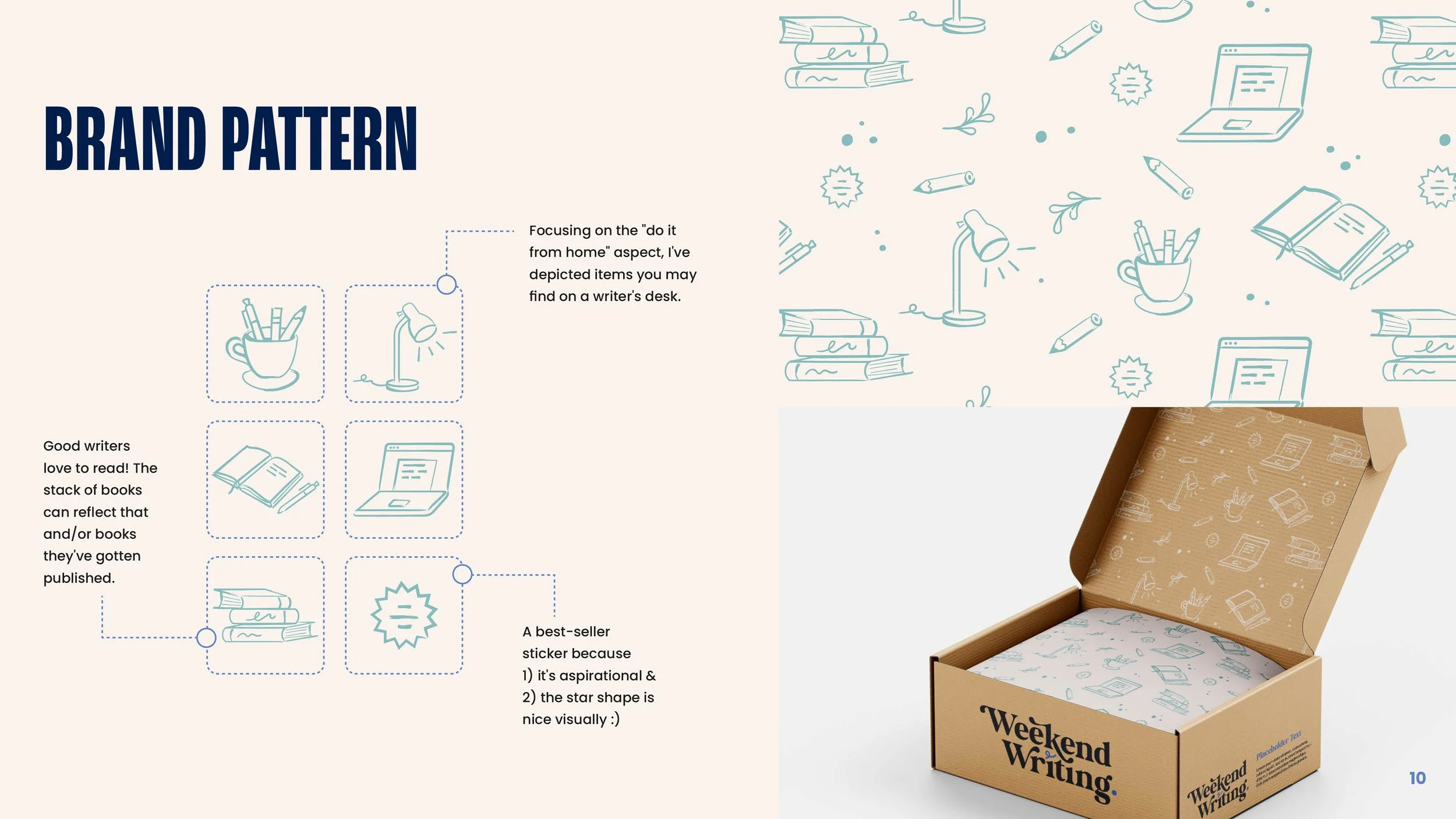
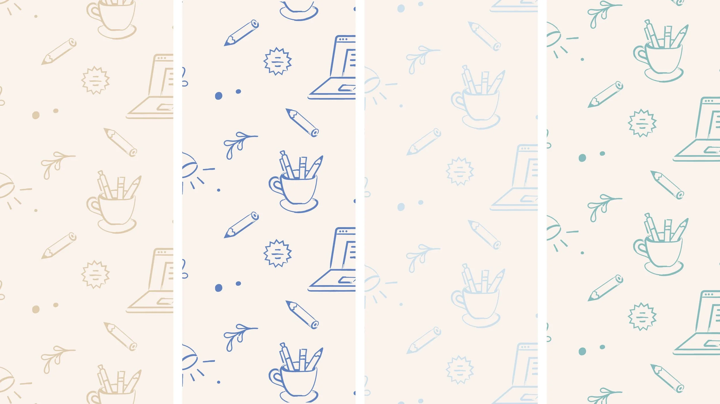
Clear communication and strong guidelines are key to consistent brand implementation. I created a comprehensive brand presentation showcasing the logo, color palette, typography, icons, and patterns, along with the rationale behind each decision. I also built detailed brand guidelines with best practices and technical specifications to ensure long-term brand integrity.
“Chelsea has been invaluable in bringing Weekend Writing to life. She's extremely thorough, very responsive, and fun to work with. We have a lot in store for Weekend Writing, and I can't wait to keep working with Chelsea to design courses, email templates, websites, and everything else that the community has to offer.”
-Lauren Bartleson