Packaging Design.
Packaging
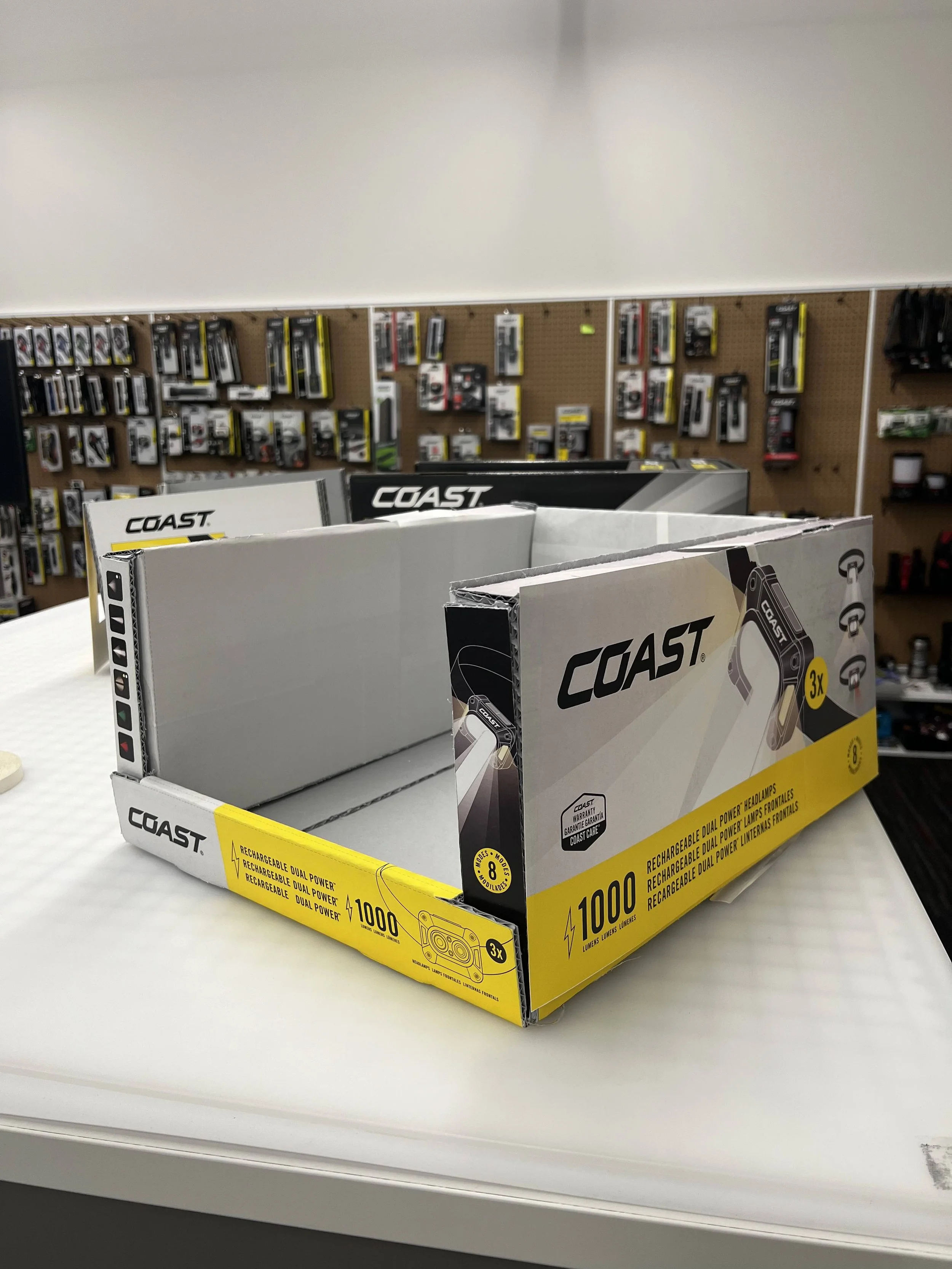
Coast
COAST is a lighting and outdoor supply company operating out of Portland, Oregon. Working alongside the Creative Director and key stakeholders, I helped designed packaging and that balanced Costco’s strict requirements with the need for bold, customer-focused design.
Project Goal: Design packaging for Costco that:
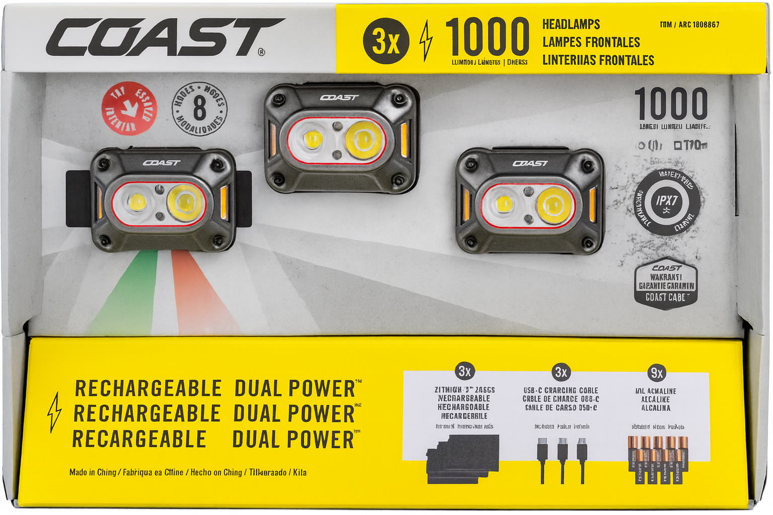
Highlights product value for Costco’s deal-seeking customers by emphasizing the multipack format and versatile headlamp features.
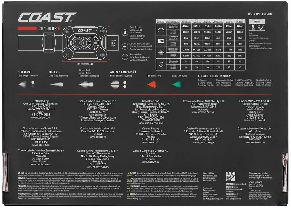
Meets Costco’s global packaging standards, including multilingual layouts (three languages equally weighted) and distributor listings, while maintaining clarity and shelf appeal.
Differentiates COAST from competitors, whose packaging often relied on darker, less visible palettes.
Creative Strategy:
Selected a bright, eye-catching brand color that stands out in Costco’s darker retail environment.
Used a light background to contrast with competitor packaging and to enhance legibility.
Simulated various headlamp modes on multiple sides of the package.
Designed a die-cut display box showcasing the primary product while integrating detailed technical illustrations of all included components.
The Process
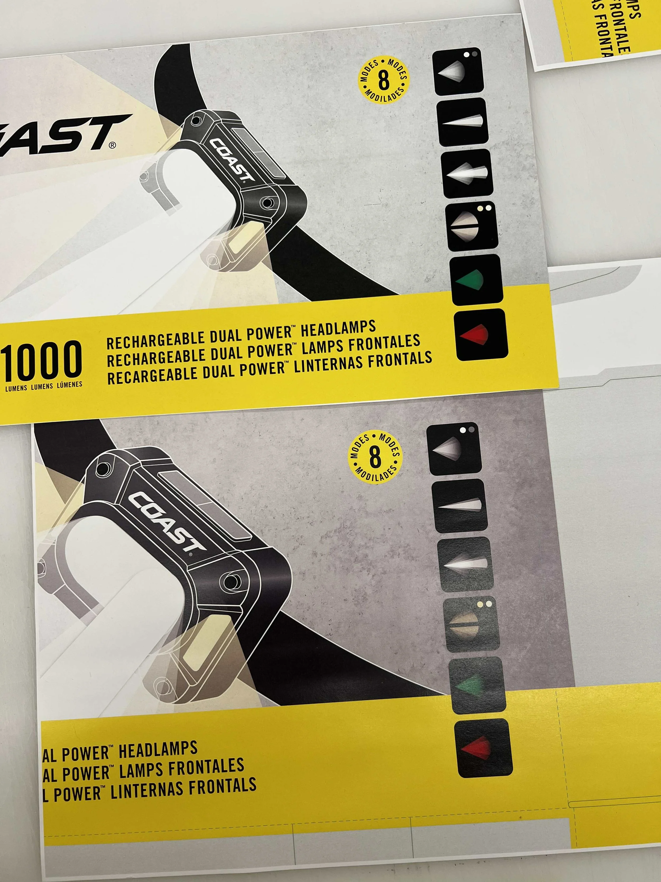
Test prints to determine the background texture and tone
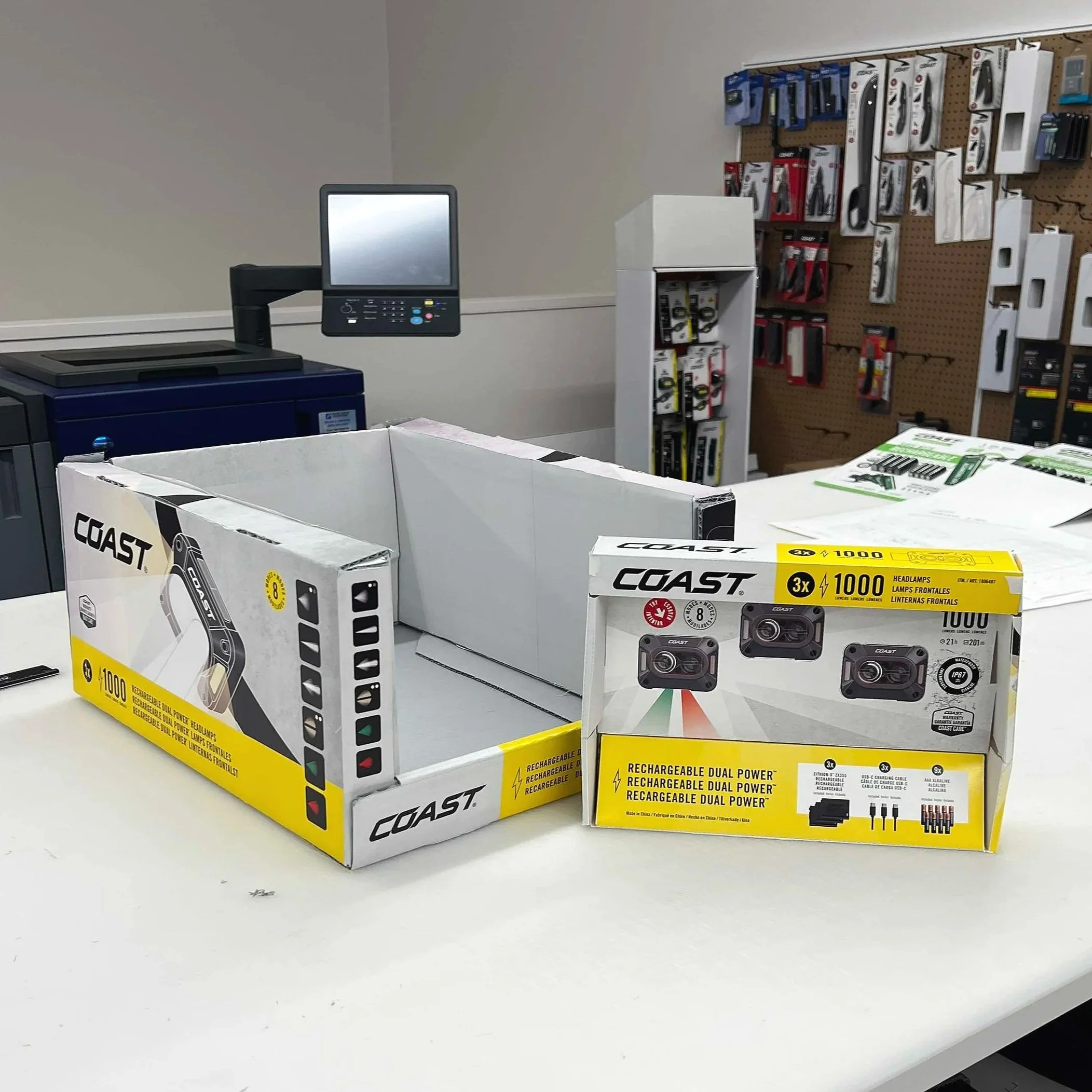
By printing and assembling models, I turned flat designs into tangible displays that guided feedback and final decisions.
An earlier version of the shelf tray, which we ultimately adjusted to be lighter in color
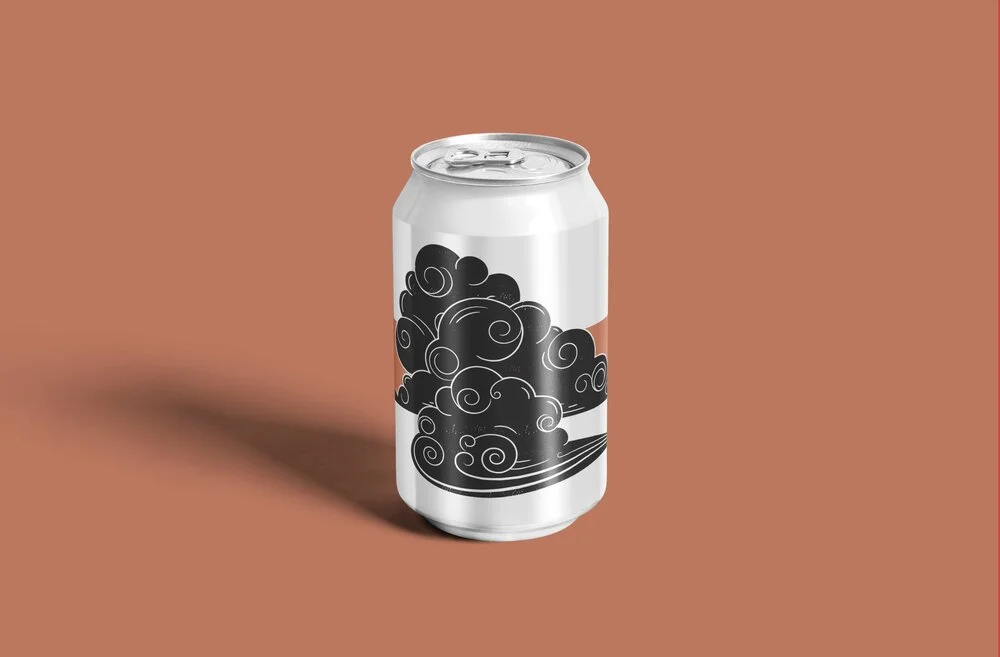
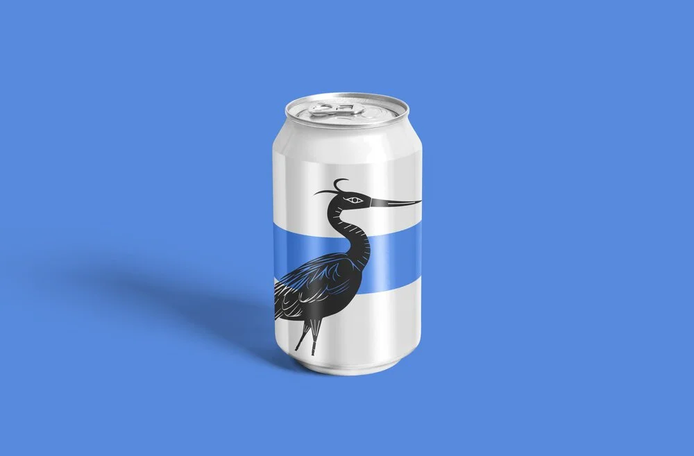
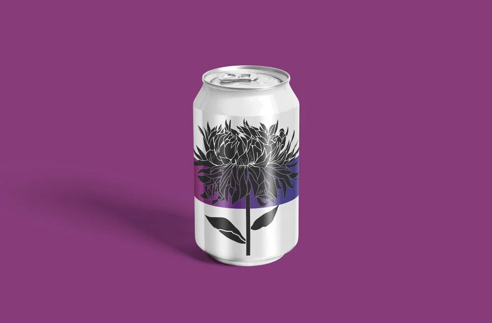
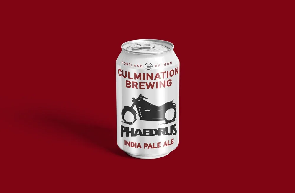
Culmination
Culmination Brewing is an award-winning local craft brewery. They commissioned me to illustrate a number of their cans in a simple, one-color, wood-cut inspired style. In this way, the could keep their aesthetic consistent and assign each beer it’s own color to build quick shelf recognition.