Cate Face
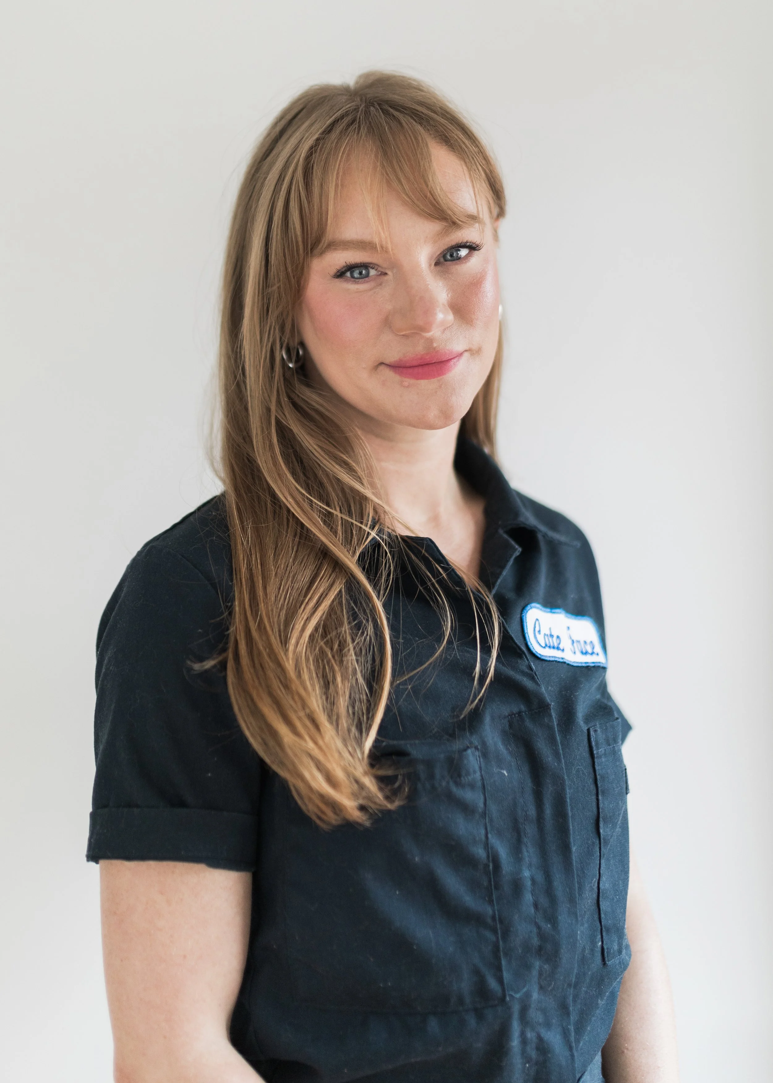
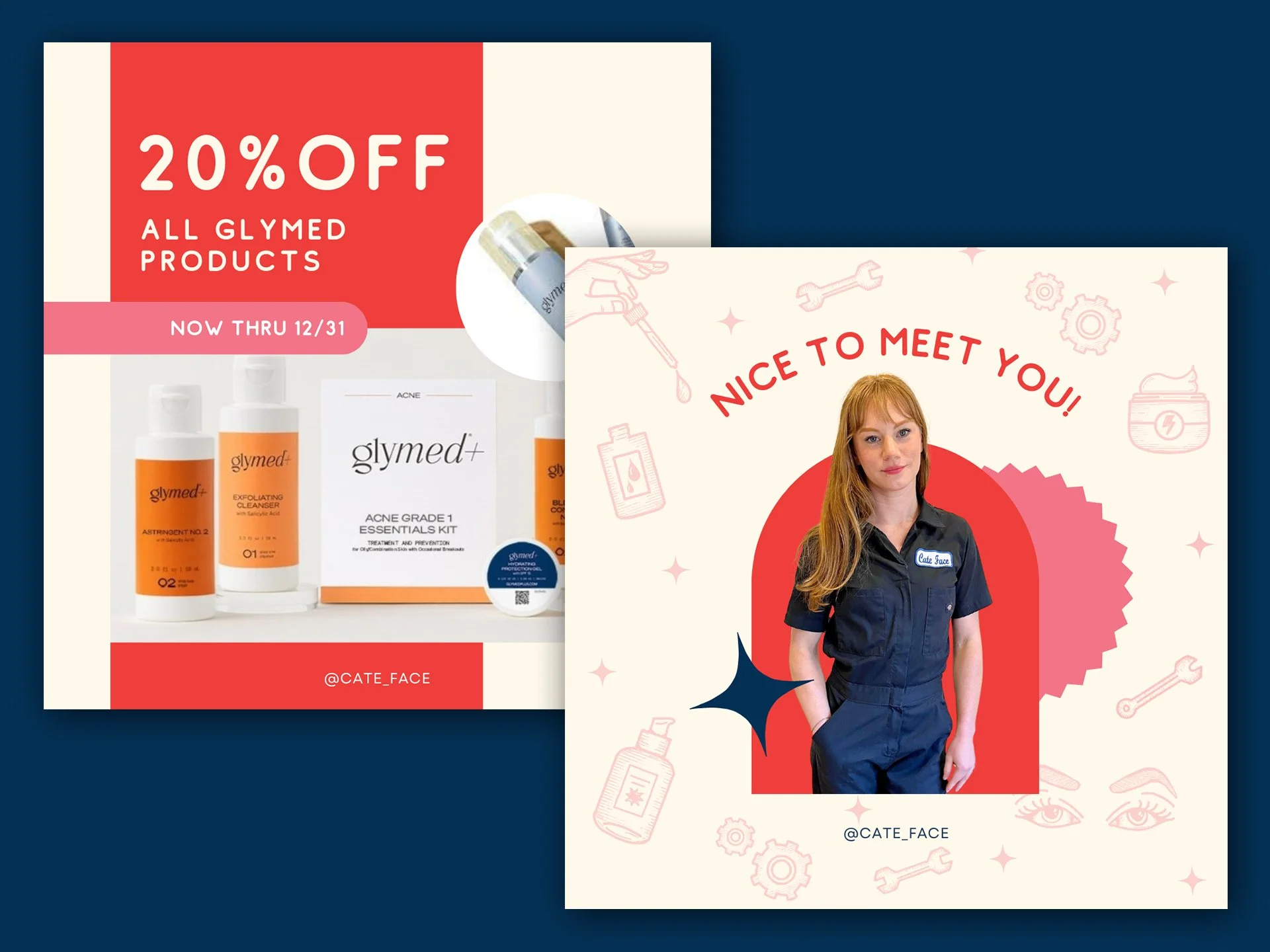
Cate (of Cate Face) is a local esthetician operating in NE Portland offering beauty services for skin, eyebrows, eyelashes, and more. She provides highly customized skincare solutions to her clients using medical grade products, helps to set them up with at-home skincare regimens, and provides valuable skincare education to her clients and social media followers alike. She does all of this in her signature boilersuit with a classic iron-on patch reading, “Cate Face”. Her mechanic-like look is fitting. Not unlike a mechanic, Cate listens to each client and evaluates their skin and current skincare routine in order to diagnose problem areas and build out a custom plan of attack for addressing their issues.
Branding.
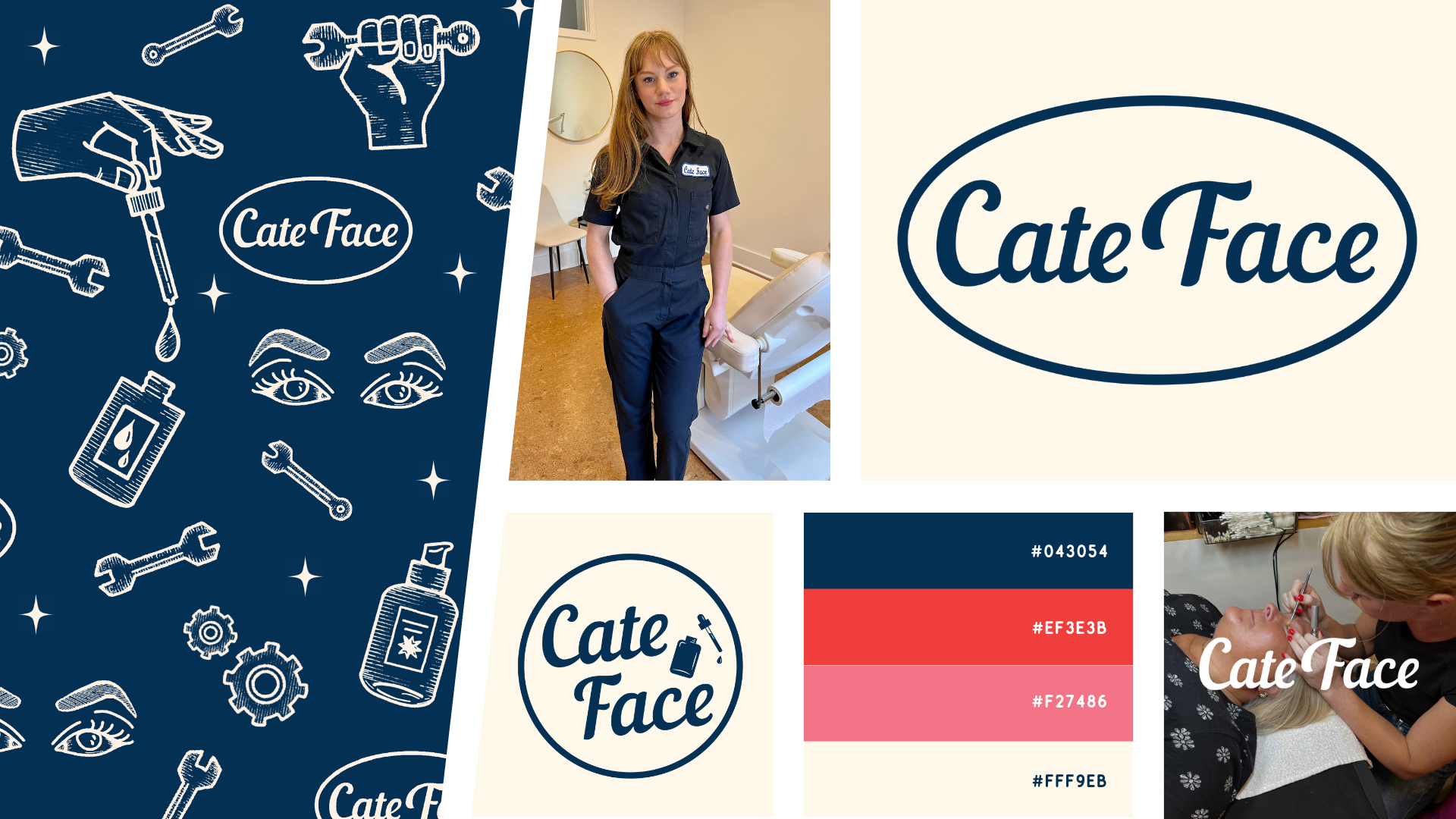
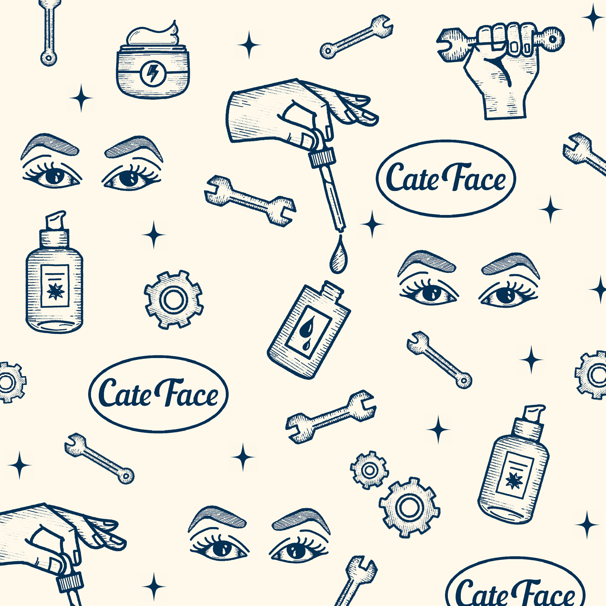
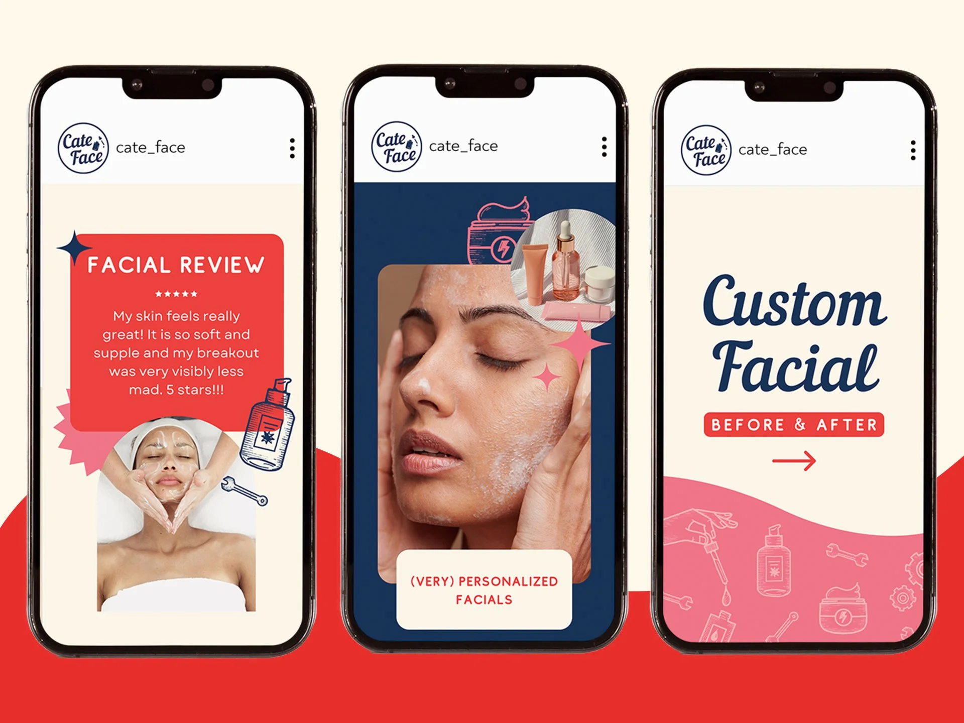
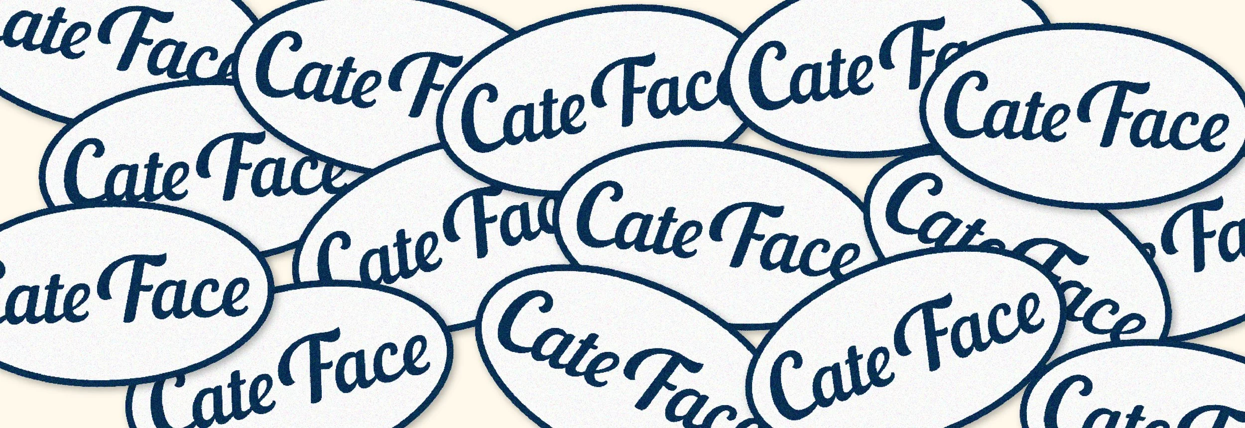
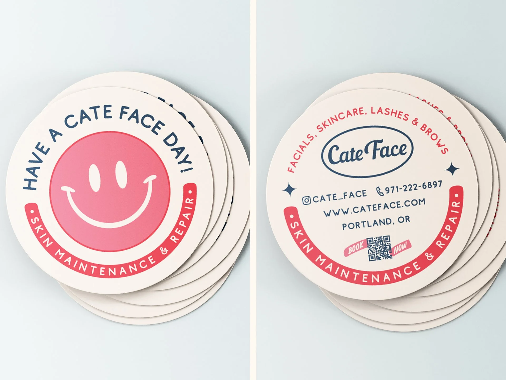
For her branding, we ran with this mechanic theme. Her logo is a simple rendition of the patch she wears on her boiler suit each day. The color palette would look at home on vintage garage signage, but it also has a splash of femininity and boldness to set her apart from typical branding in this sphere that leans toward lighter pastels. The same is true of the illustrated brand pattern I created for Cate Face. It reads vintage utilitarian and, stylistically, is unlike typical imagery in this sphere while still communicating the nature of her services through overt depictions of skincare products and soft touches such as smaller stars and twinkles.
Cate of Cate Face: